The Brief
abloom is a flower delivery app that aims to streamline and simplify the buying process. Bouquets and floral arrangements have the unique quality of being big and beautiful, meaning the companies that make them need to offer goods that match.
Setting the Scene
Normally I’d start with a general approach to the idea: who uses the app, what could it look like, what should users accomplish, etc. Truthfully, I was going into this without any experience with buying flowers. I’ve probably bought flowers once or twice, and just the other day I couldn’t remember the name of a daffodil. Needless to say, I started with a competitive audit to get an idea of what I’m dealing with.
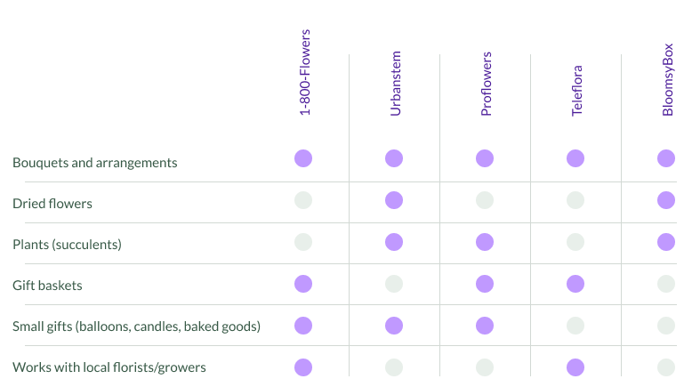
One thing almost immediately came to mind: what about people who just want to buy a specific flower? Or people who enjoy building their own floral arrangements? I’m sure they would end up going somewhere locally, but that could be hard to achieve for many people.
While a lot of those involved have diverse offerings, which is great for their customer base, it can appear overwhelming to try and navigate.
User research was conducted through informal remote surveys that included both informal surveys and hobby florists.
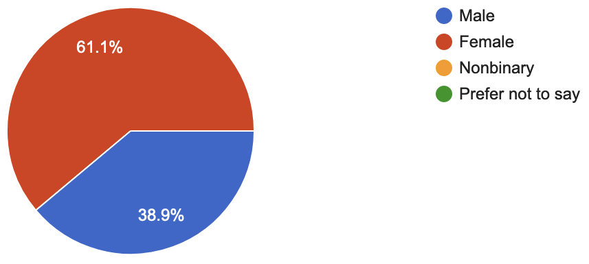
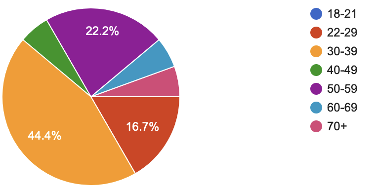
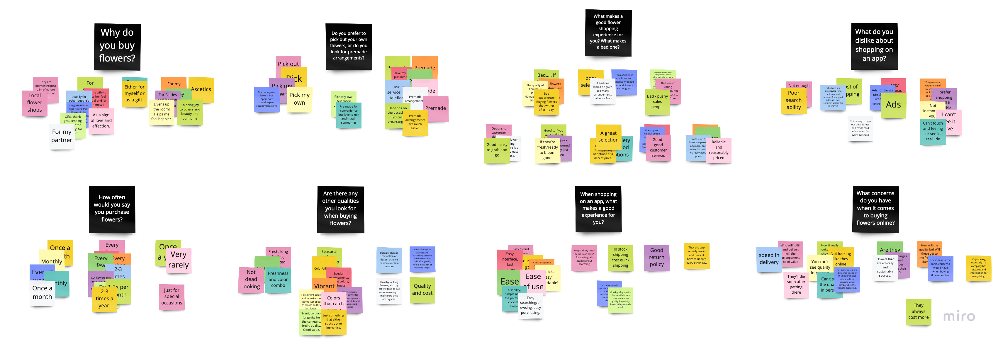
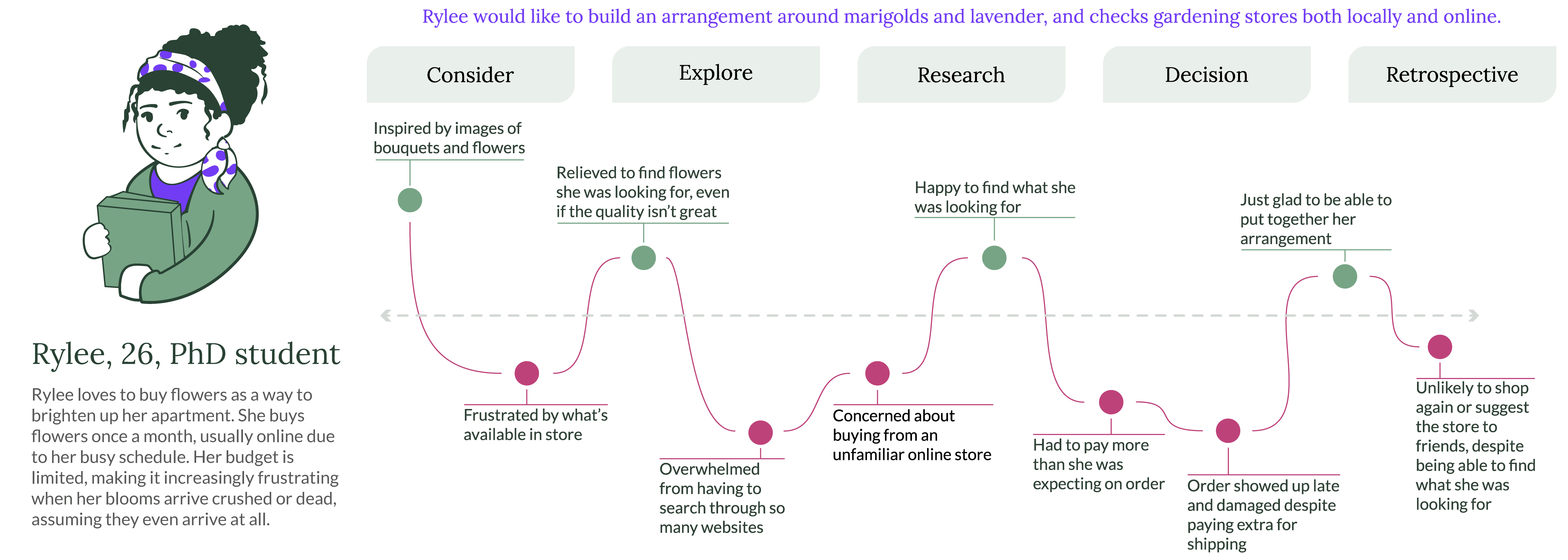
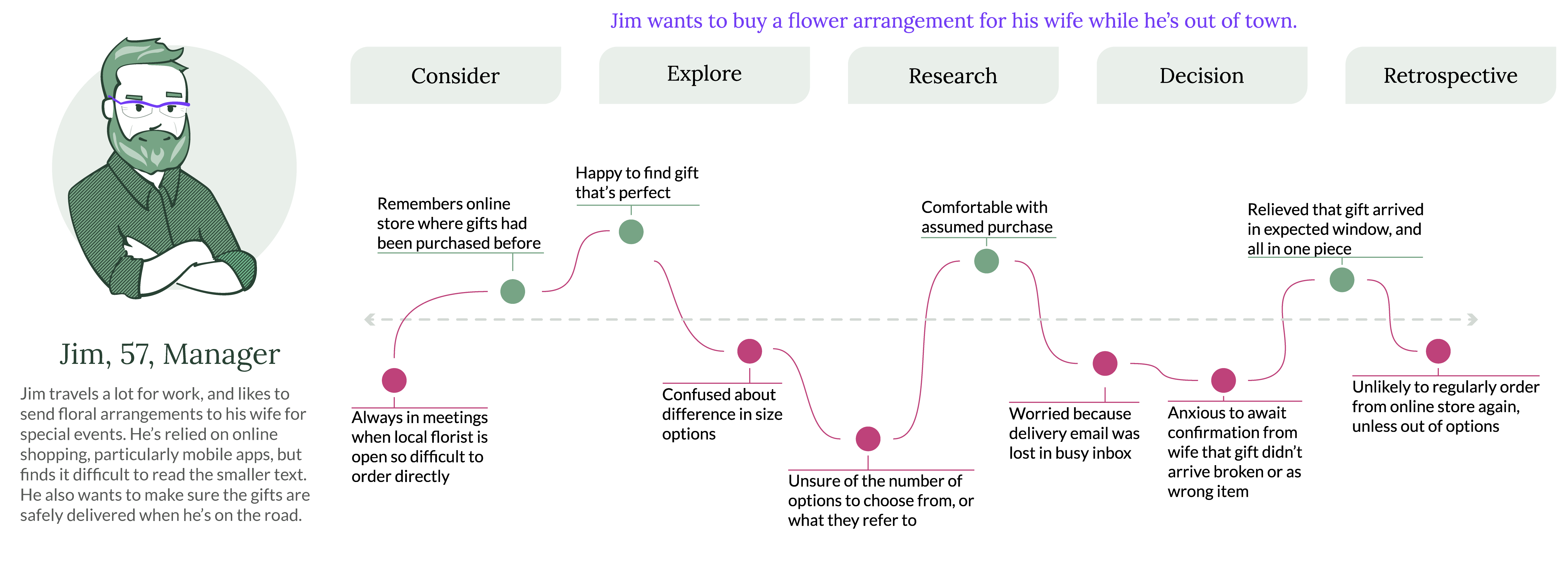
The personas developed from research reflected two major standouts from the feedback, namely that the number of users that buy flowers for themselves and the number that buy them as gifts were relatively equal. They also reflect the major purchasing concerns of quality and price.
First Draft

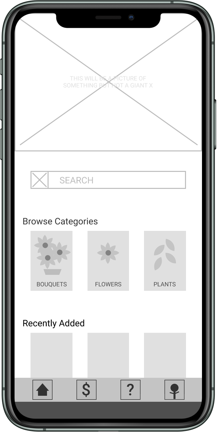
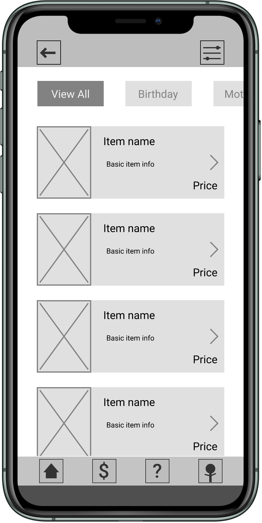
It was obvious from the beginning that the one single most important aspect of purchasing flowers is how it looks, so making images from and center was a major focus of the initial wireframing. The idea was also to open up and simplify the categories while still allowing for the wide variety of products offered.
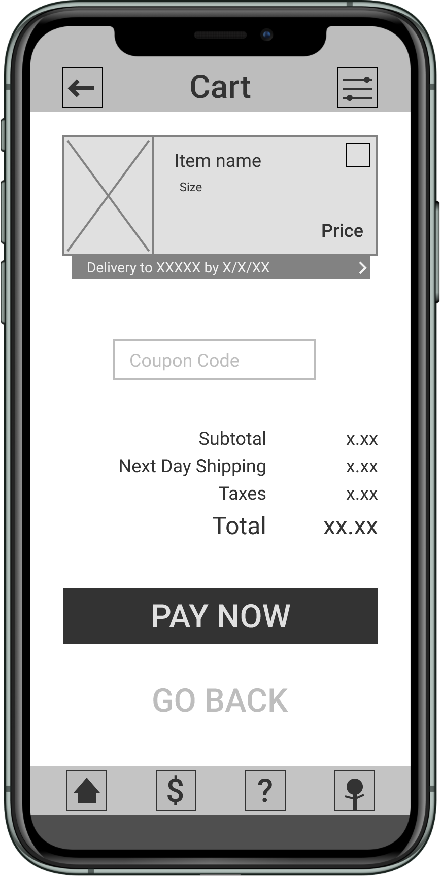
Production Notes
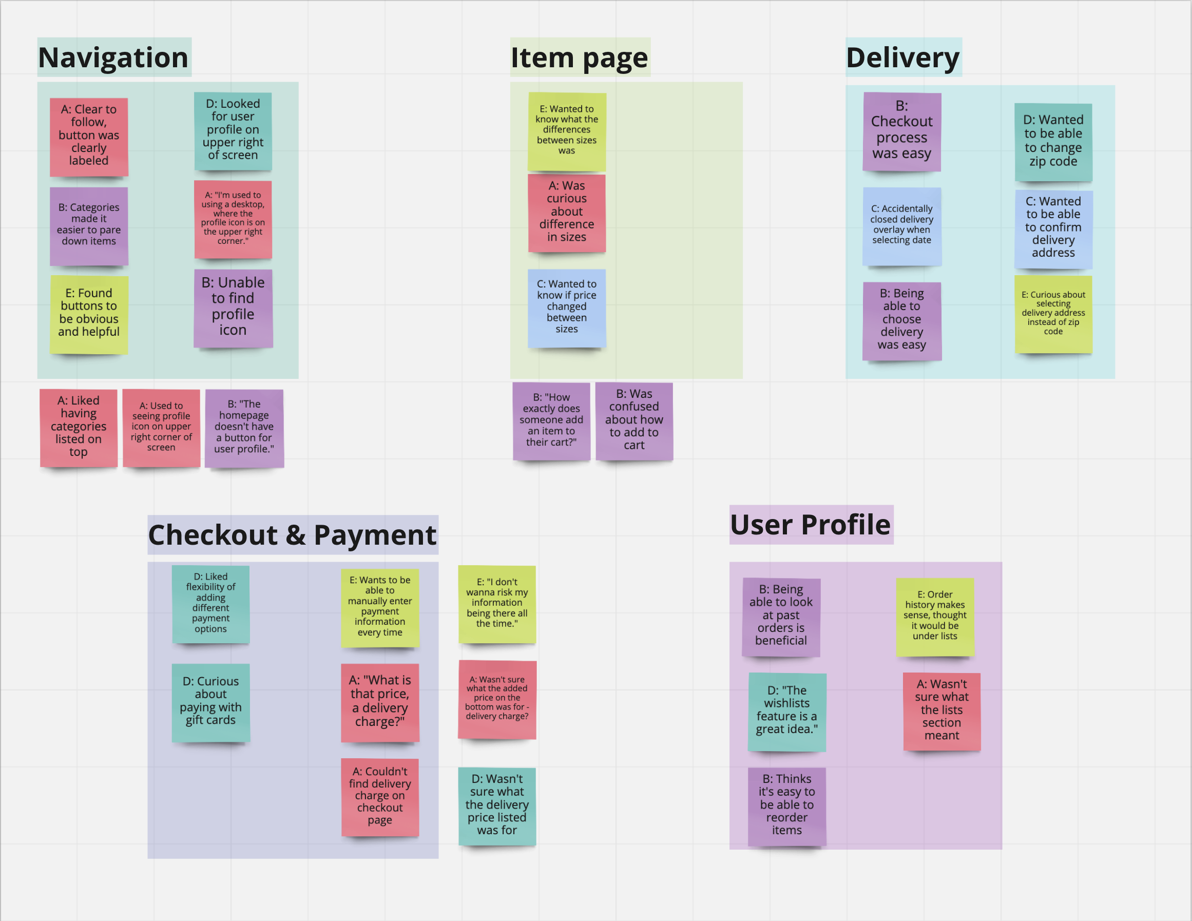
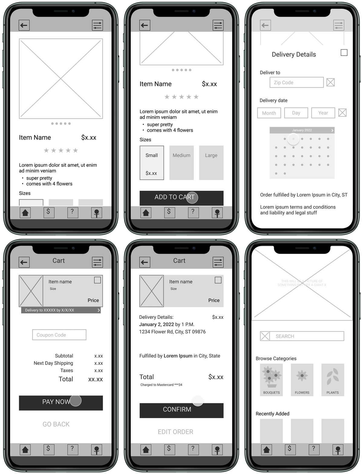
The low-fidelity usability study was hugely beneficial to highlighting problem areas that were overlooked. Having pictures is great, but having clear language is even better. After all, there’s no point in trying to include interesting features if users don’t know what they are or where to find them.
Pain Point: Purchasing
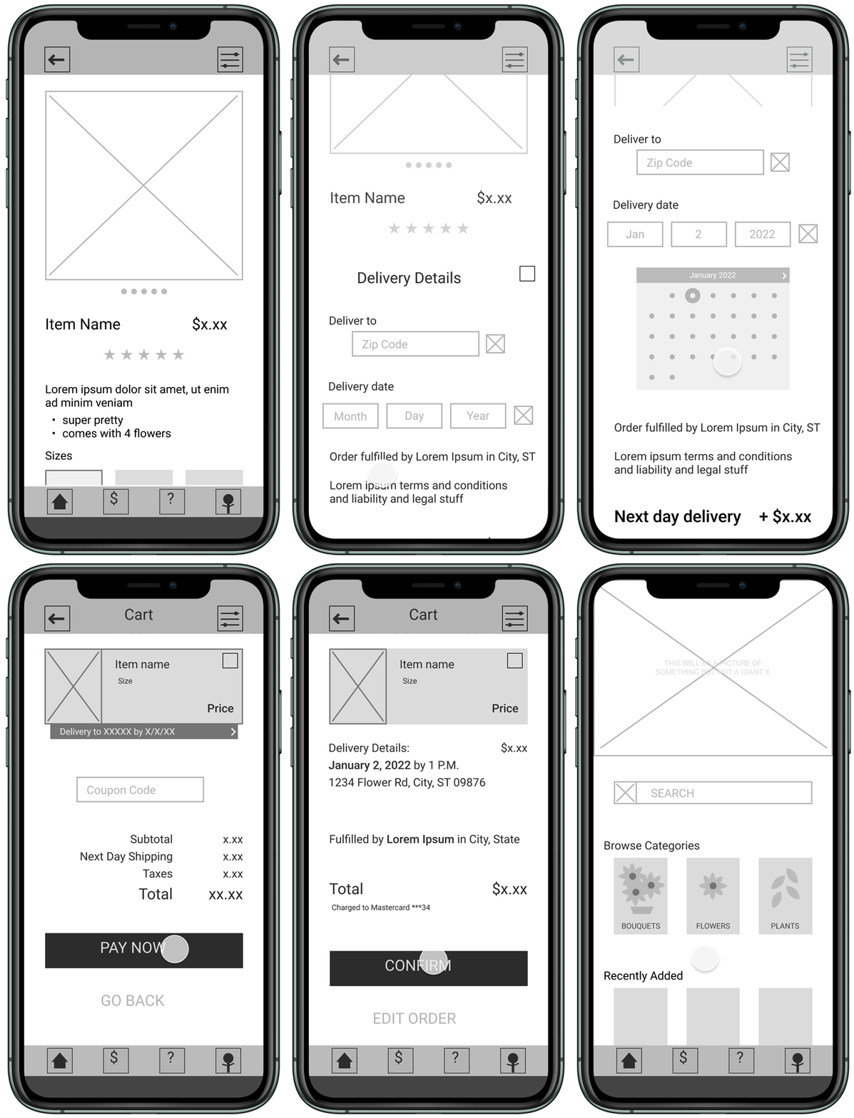
One highlight from the usability study was that users felt confused after placing an order, namely that they weren’t confident their order was actually placed.
Solution
The fix was to add a confirmation screen after the purchase was successful.
Premiere
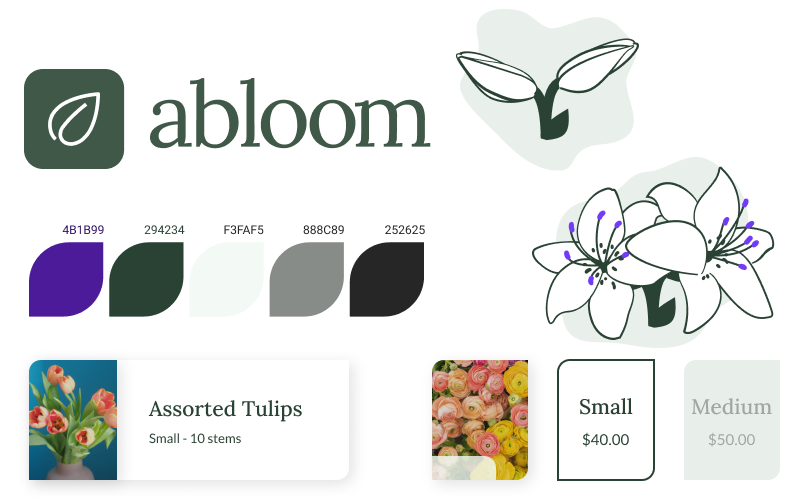
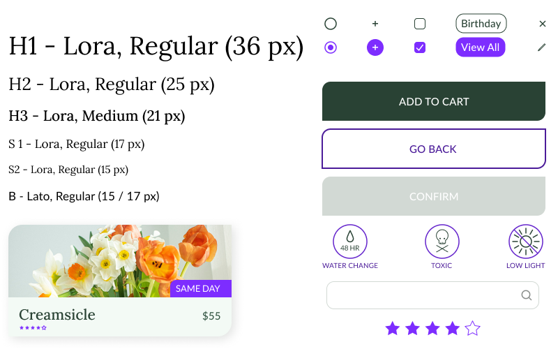
The obvious choice for any floral or plant-based product is to go with green, but I made it slightly more muted to avoid going the direction of Uma Thurman as Poison Ivy (though, maybe someday).
Delivery Details
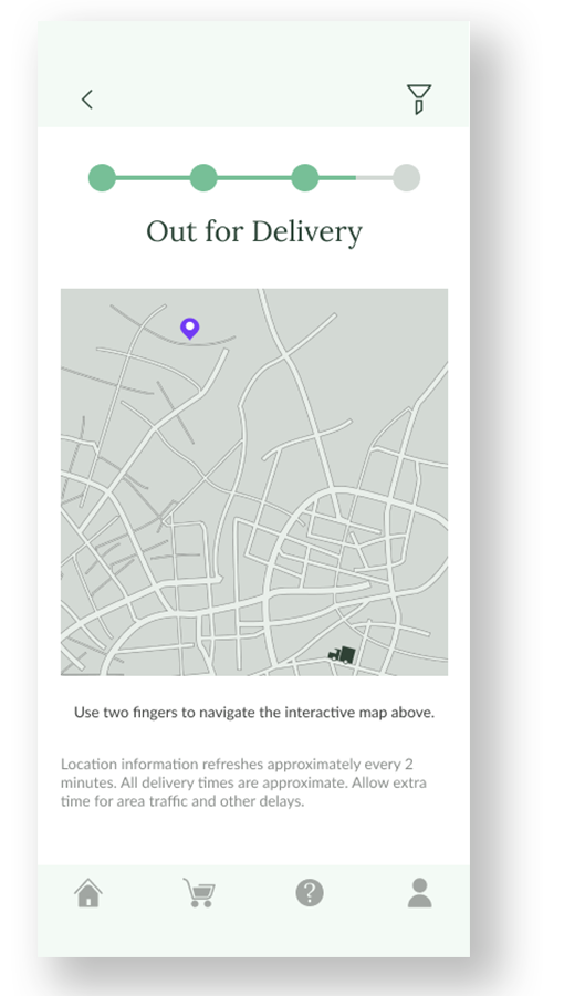
Users are able to view the progress of the order delivery in close to real-time, so they can verify its arrival even when they aren’t at home.
Order History
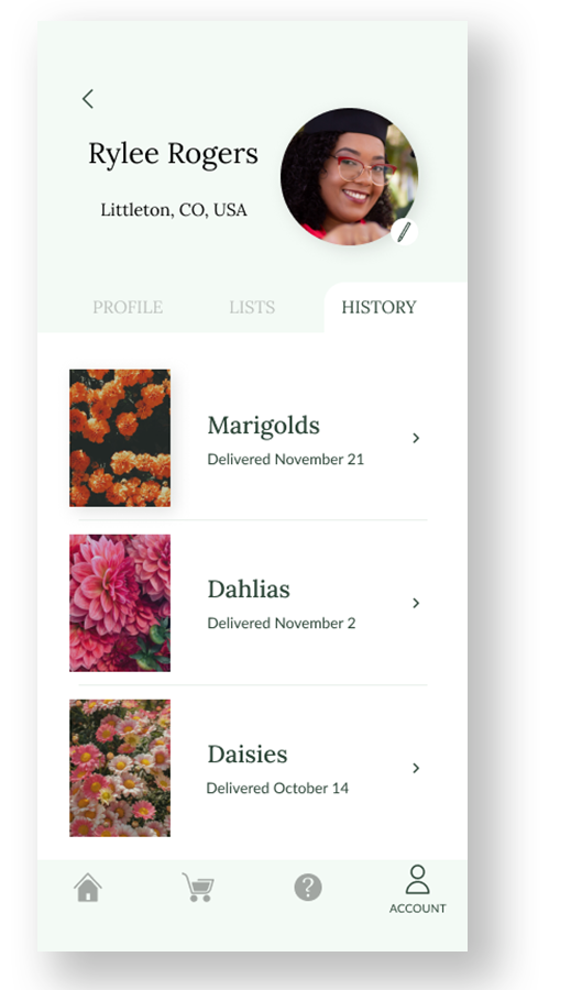
Users are able to view the progress of the order delivery in close to real-time, so they can verify its arrival even when they aren’t at home. This also allows them to reorder past purchases if available.
Browsing
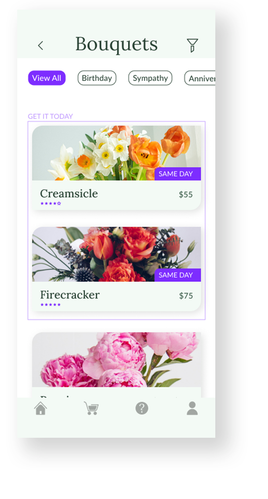
Sorting by holiday or occasion makes shopping simpler for users looking at bouquets, and highlighting what’s available for same-day delivery helps users that are short on time.
Sequel Talk
Expansion of the app would include more work in picking individual flowers for hobbyists or otherwise, including what kind of options would be possible and how that would look for users. This could also potentially include a subscription service – a popular concept most of the competitors offered in some way.
I also learned that in many cases, simple is possible. Offering too many products or throwing too much information at the user can quickly turn into a negative experience. Users want options, but not so many that they feel like they’re being thrown into the deep end without a life vest.
I’m always more than happy to branch out into unfamiliar territory, even if it’s a subject that I have little interest in. Ultimately, my interest isn’t the one that matters, it’s the user’s.
