Mobile UX/UI with Kaan Senocak for ART 398 – Interactive Design with Melanie Uribe
The Brief
Perhaps the most baffling paradox in America results from two facts:
- Many Americans struggle with hunger and food insecurity
- Food waste accounts for nearly half of our food supply
There’s way too much that needs to happen in modern society to fix these issues, so it’s down to individuals to analyze their own habits and make changes. One More Dish was designed to help with exactly that.
Tools used were Adobe Illustrator and Figma.
Setting the Scene
So, the idea we started with was “something to help alleviate food waste.” We wanted something actionable, where users were actively helping their community. We conducted research with informal interviews on two user groups: individuals/an average person who’s either eco-conscious or aware of the food waste issue (referred to as “volunteers”), and professionals in the food industry, such as restaurant or business owners. The questions specifically targeted the ability and willingness to compost leftovers, set aside unwanted food that could be donated, and volunteer to help get the goods to where they’re needed:
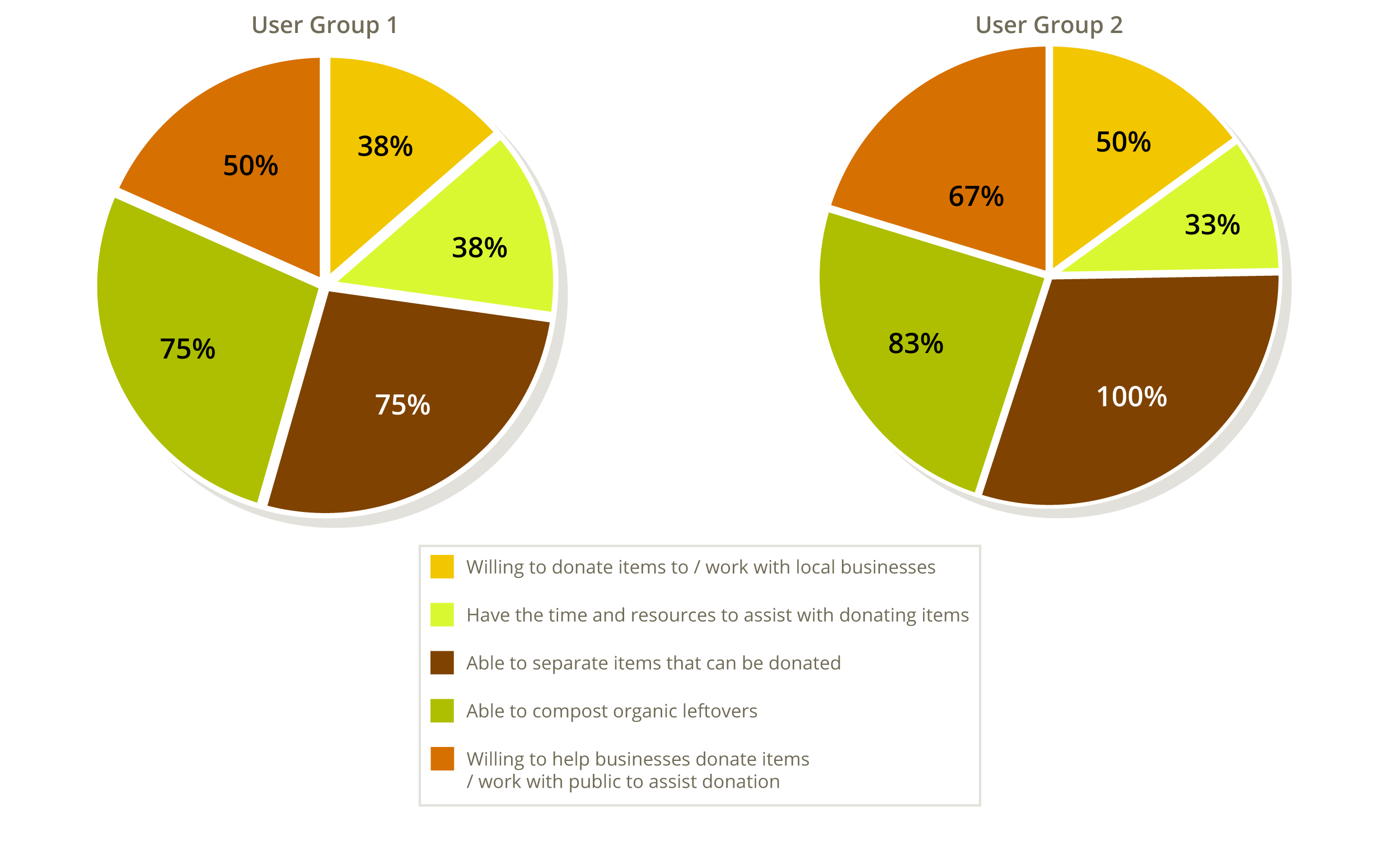
Based upon the surprisingly similar results from the interviews, we went in the direction of facilitating food donation and user connection.
One important distinction we also learned is that a number of business owners, especially older ones, can find mobile apps to be too complex and confusing to use on a regular basis. We decided that a simpler layout and user flow was the easiest way to manage this possible pain point.
First Draft
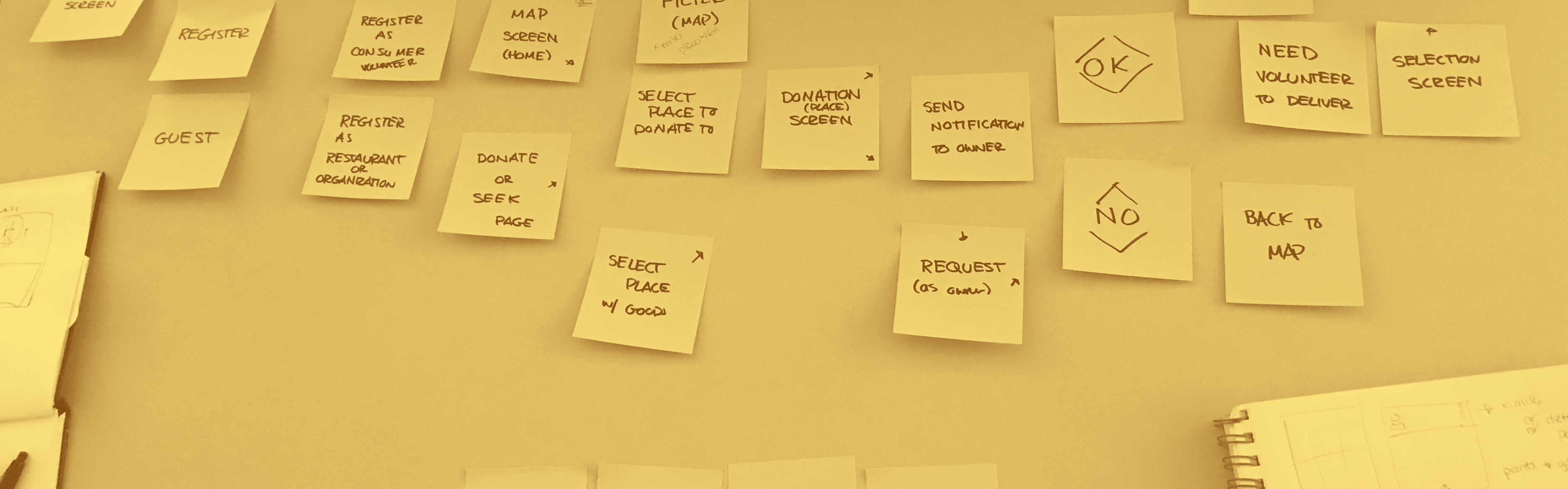
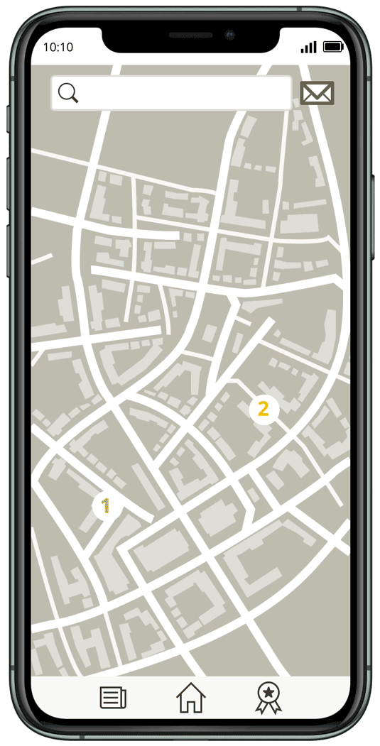
The easiest way we approached it would operate similar to any rideshare or online delivery platform: users would open on a map where they could choose locations that fit their criteria. We wanted to be able to let users distinguish between three main actions: donating, collecting, or transferring goods.
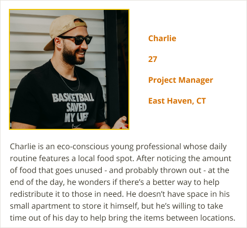
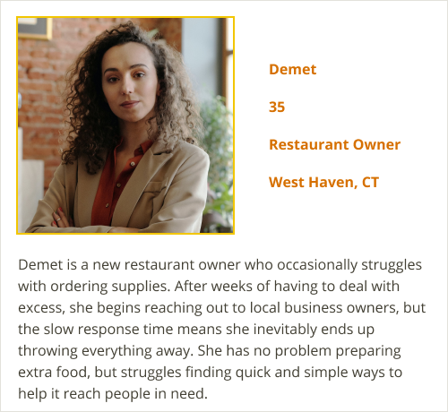
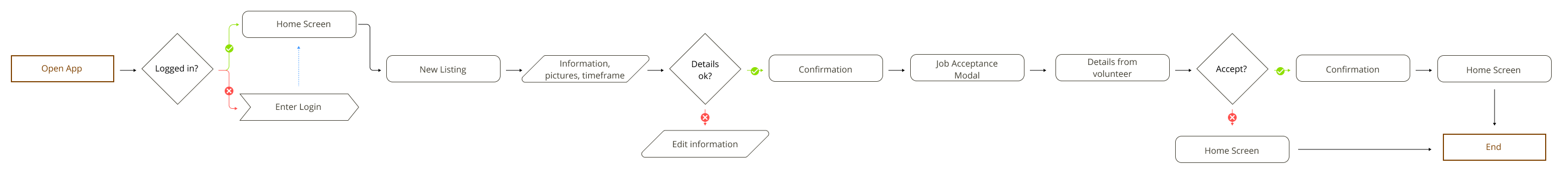
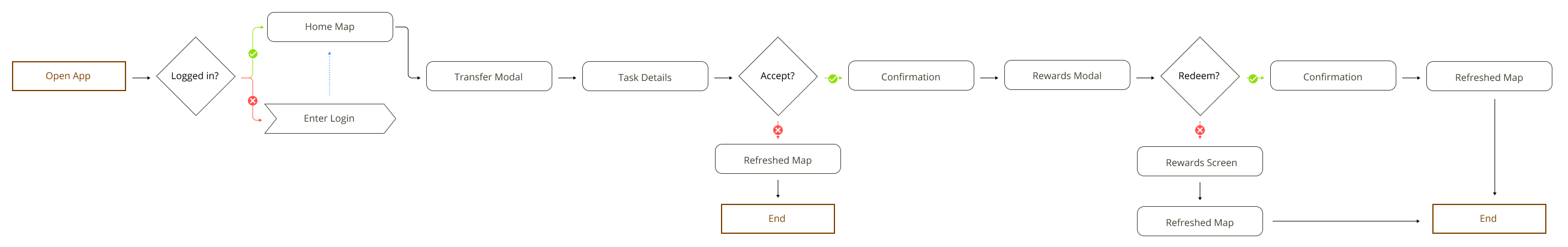
Since we wanted there to be a distinction between the casual/average user and a business owner, we started with two user flows.
Production Notes
Note 1: Why?
One big area we didn’t focus on initially was incentive. Ideally, users would be more than willing to help out for the good of their community…but realistically, users like to have some sort of tangible goal, and users are more likely to use the app of there’s some sort of reward to work towards. So, we developed a points reward system where the rewards would be beneficial to both types of users: gas and grocery discounts.
Note 2: education
Given the importance of food waste as an issue, we wanted to have some sort of educational aspect that specifically covered news both locally and internationally as it related to food waste and hunger. We also wanted an area to possibly expand to include information on how to compost and basic food safety.
Premiere
The primary color ended up as a golden yellow, with orange and green to reflect a sort of aspect of warmth and welcoming. Most products that revolve around recycling or social good use greens and blues, and we wanted ours to stand out among them.
With the rewards system and news aspect integrated, we developed the user flow to create a high-fidelity prototype of our app.
Prototype is visible here on Figma.
Sequel Talk
In April 2021, we presented One More Dish as a part of the Undegraduate Student Research and Creativity Conference at Southern Connecticut State University.
Continued work on One More Dish would address the accessibility concerns with the current color palette, and with that would come more usability testing. We would also expand the educational aspect to include more basic how-tos that are related to food waste, like composting and basic food safety.
It was such a great process to see how to approach a social issue like food waste from the perspective of a designer. Taking users and other real-world components into consideration when designing really makes you feel like what you’re doing could actually have an impact on something, no matter how small.
