
The Brief
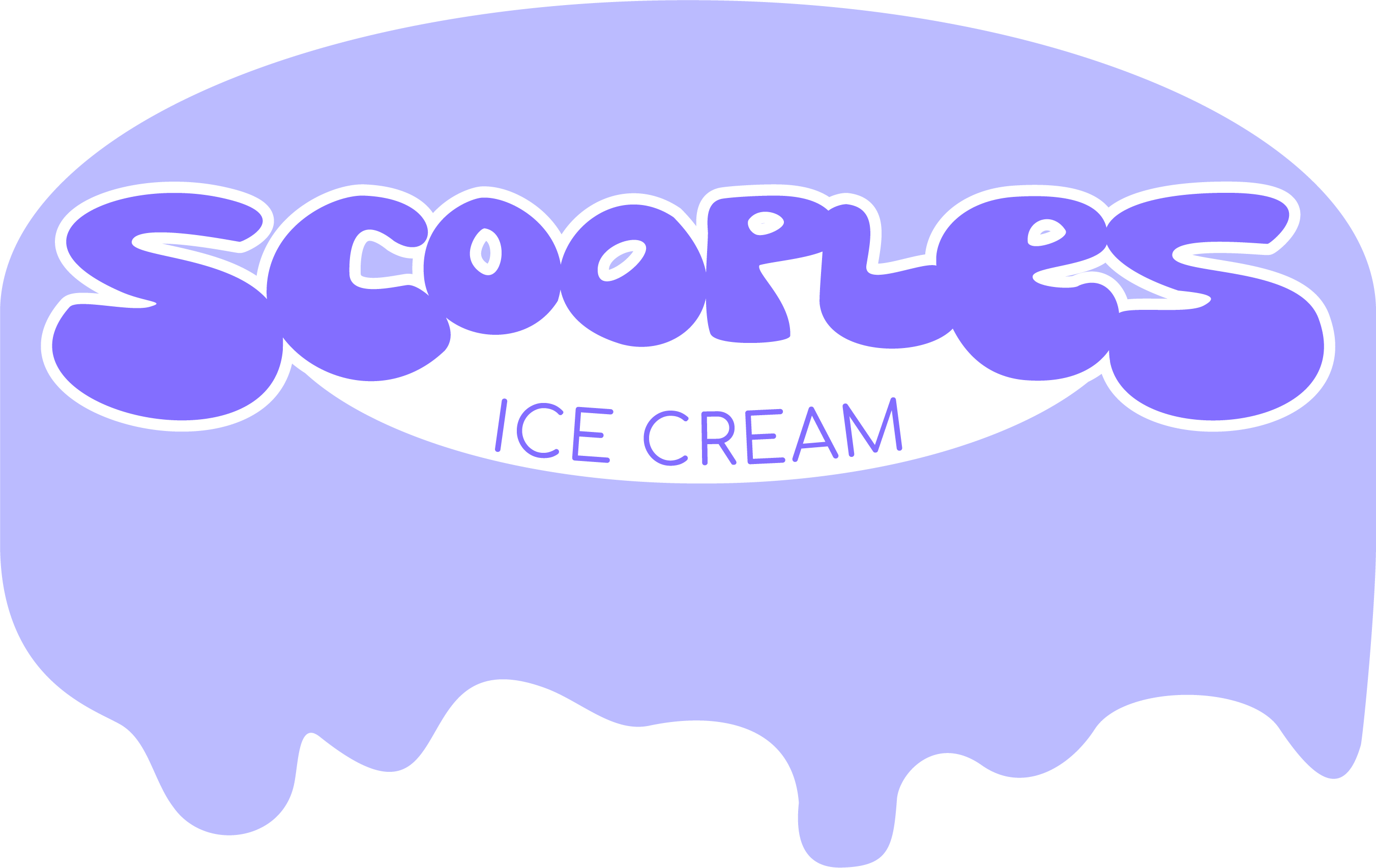
Scooples doesn’t make itself known as a quirky local ice cream spot, but its loyal customers have considered it that for almost 30 years. With flavors like “Hungry Hippo” and “Drama Queen”, and a slapdash handmade aesthetic, it’s quite the standout snack spot.
Setting the Scene
The slapdash sort of avant-garde feel of Scooples is the one thing that makes it stand out from the others, but is it possible to uphold that appearance while also maintaining a consistent brand?
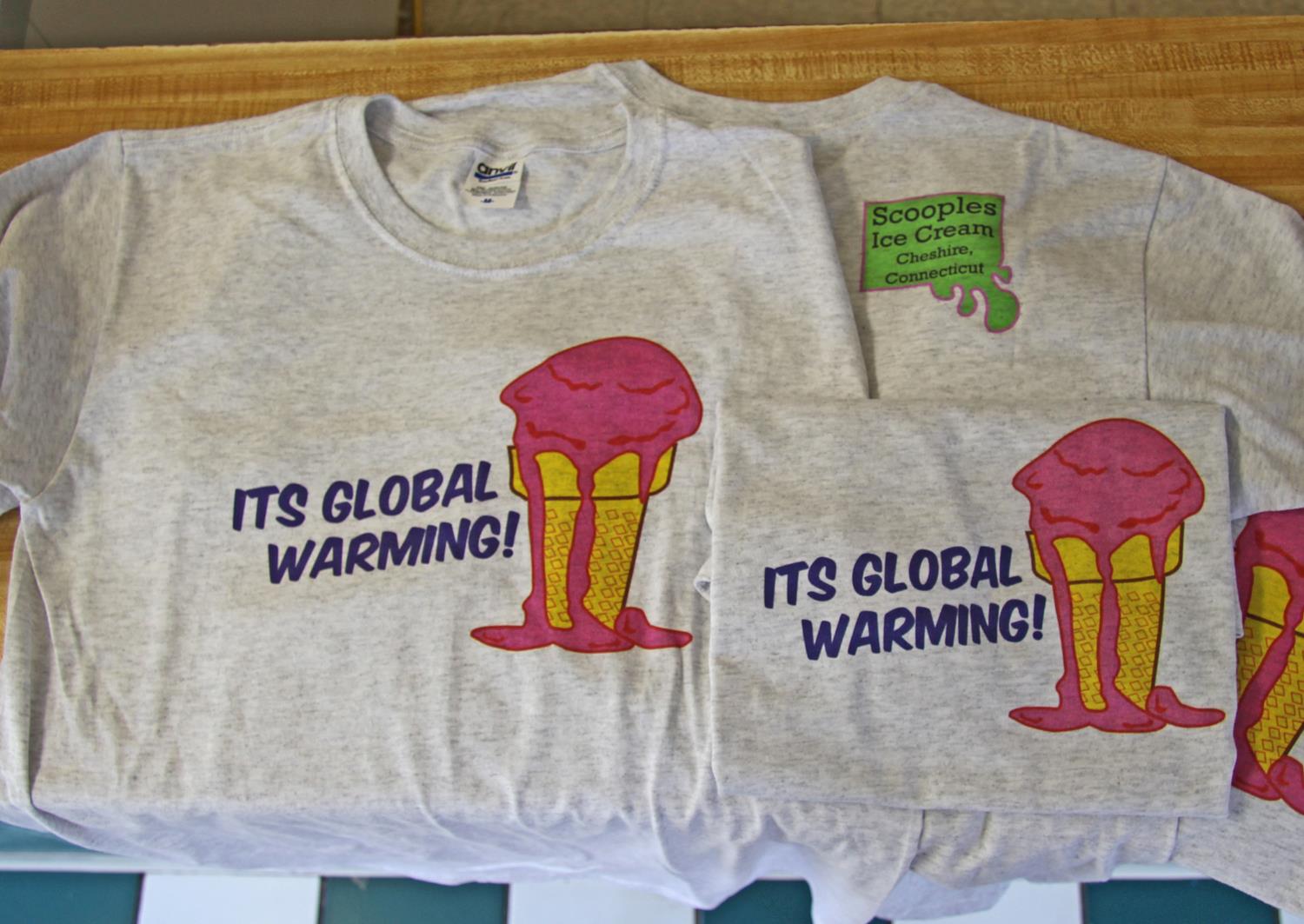
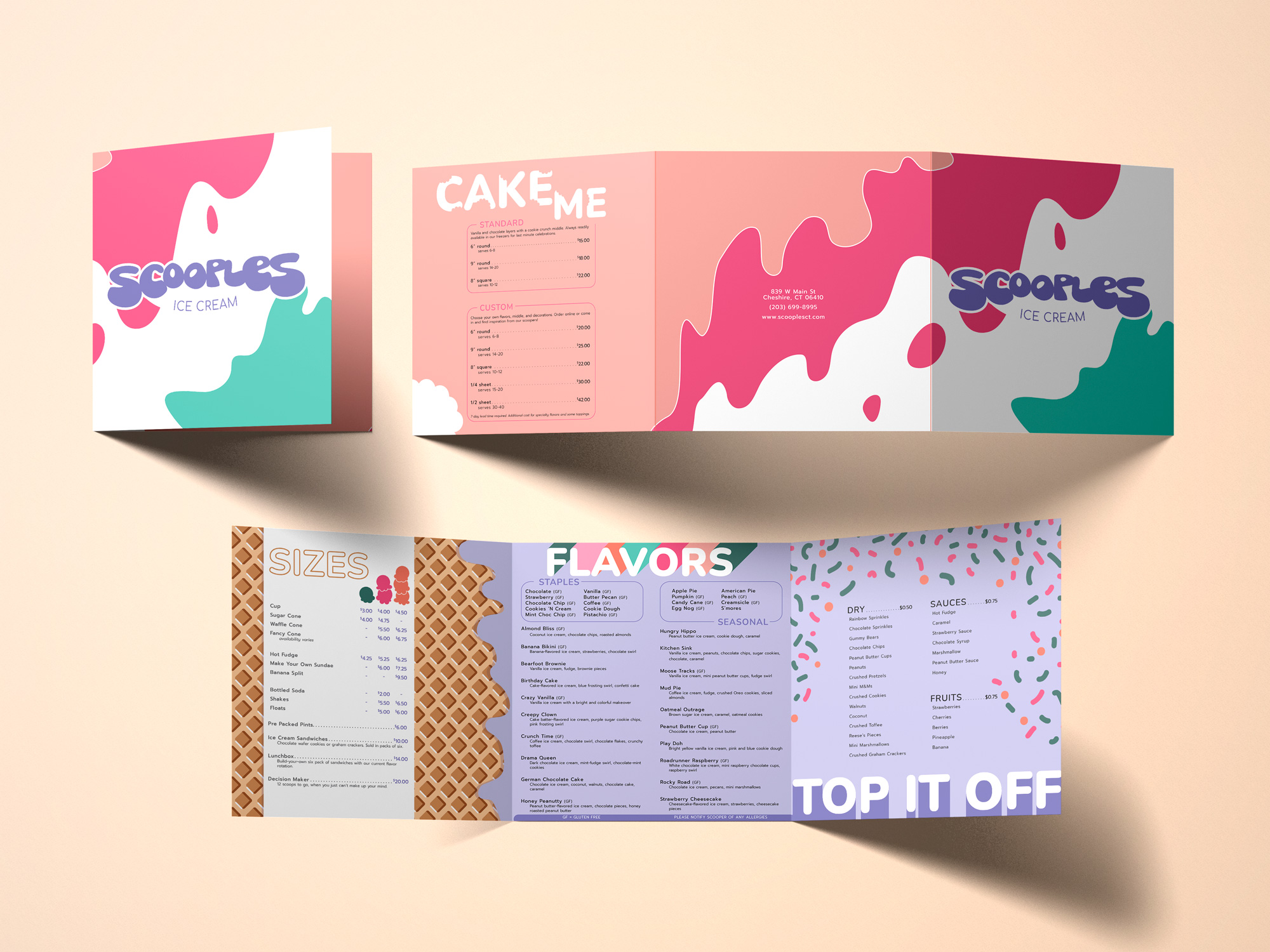
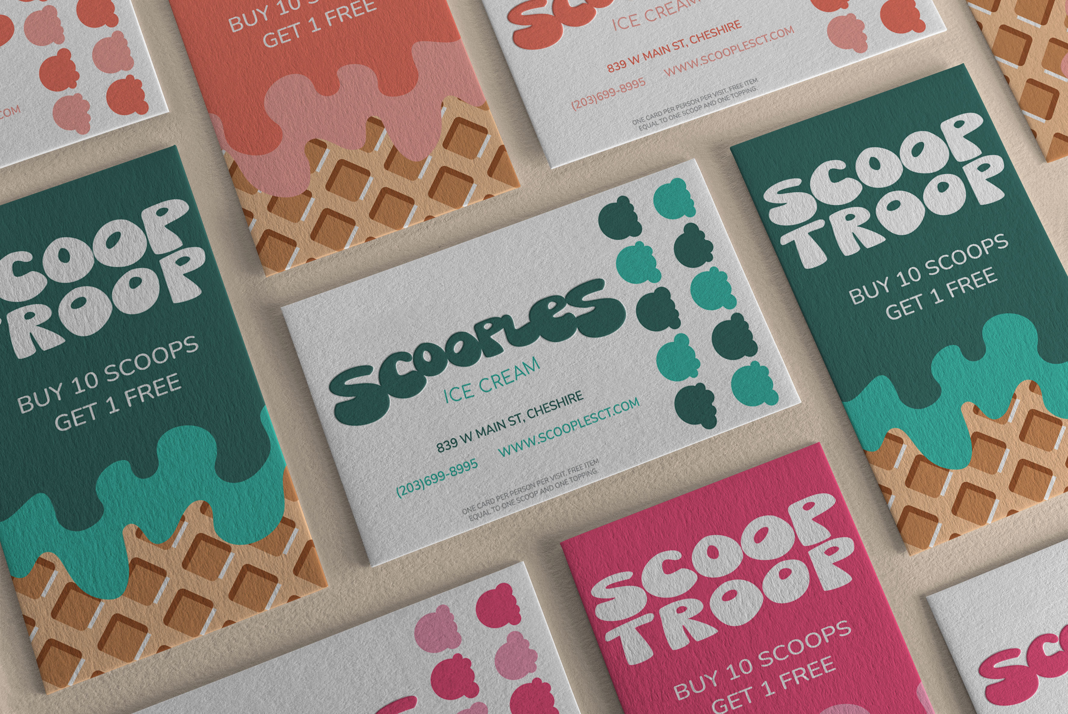
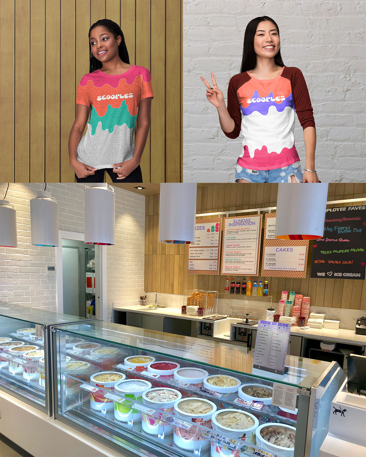
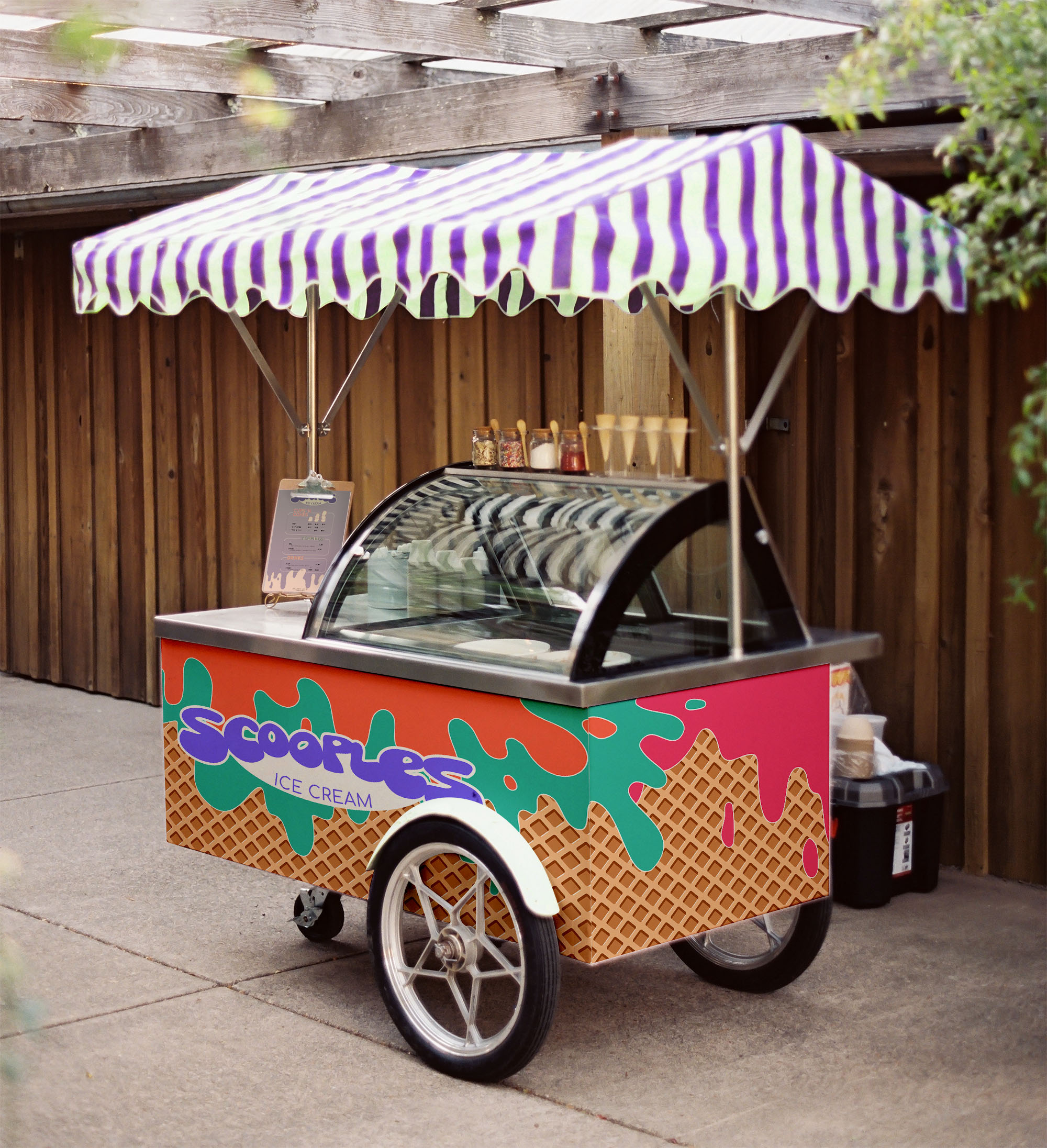
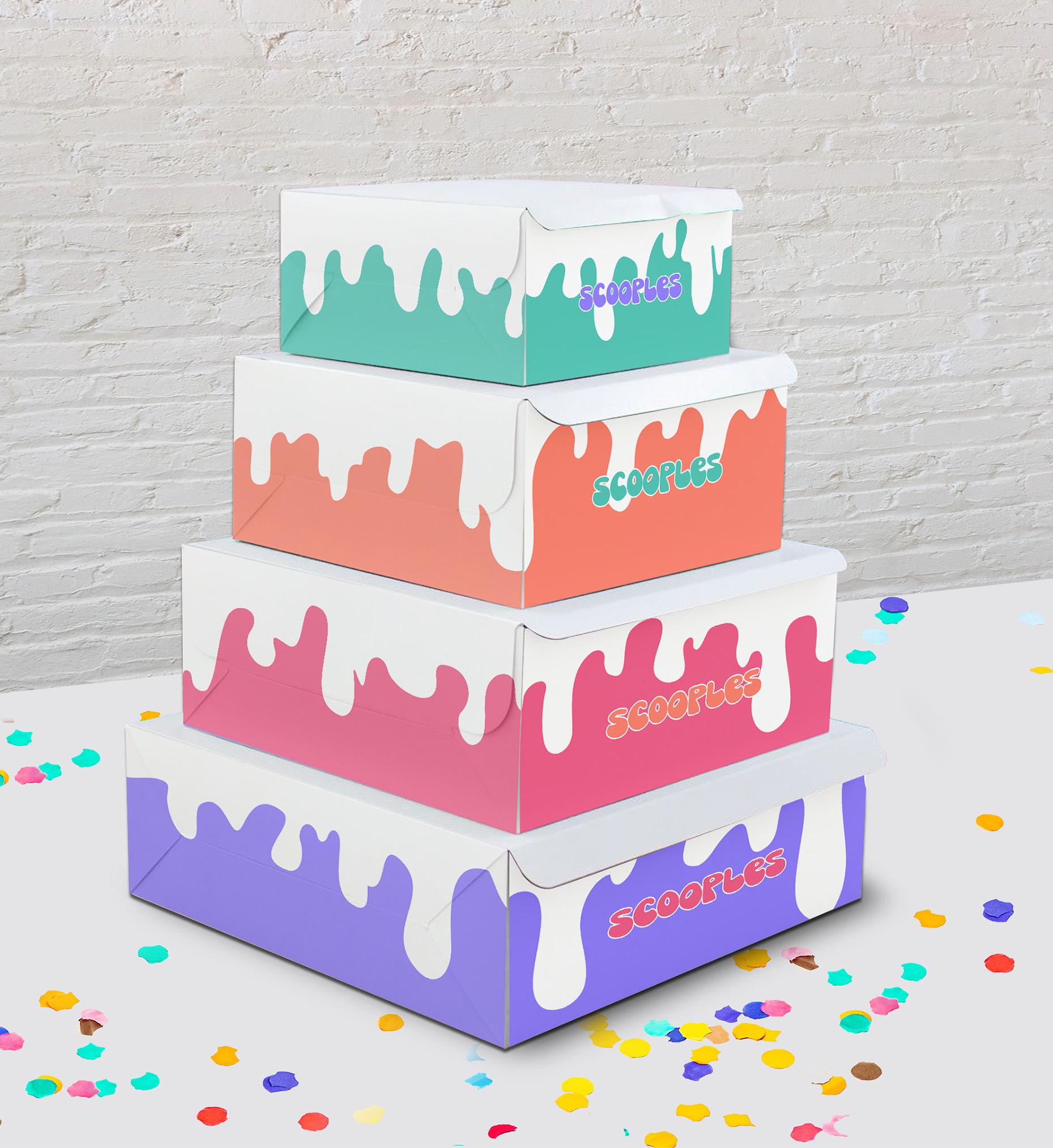
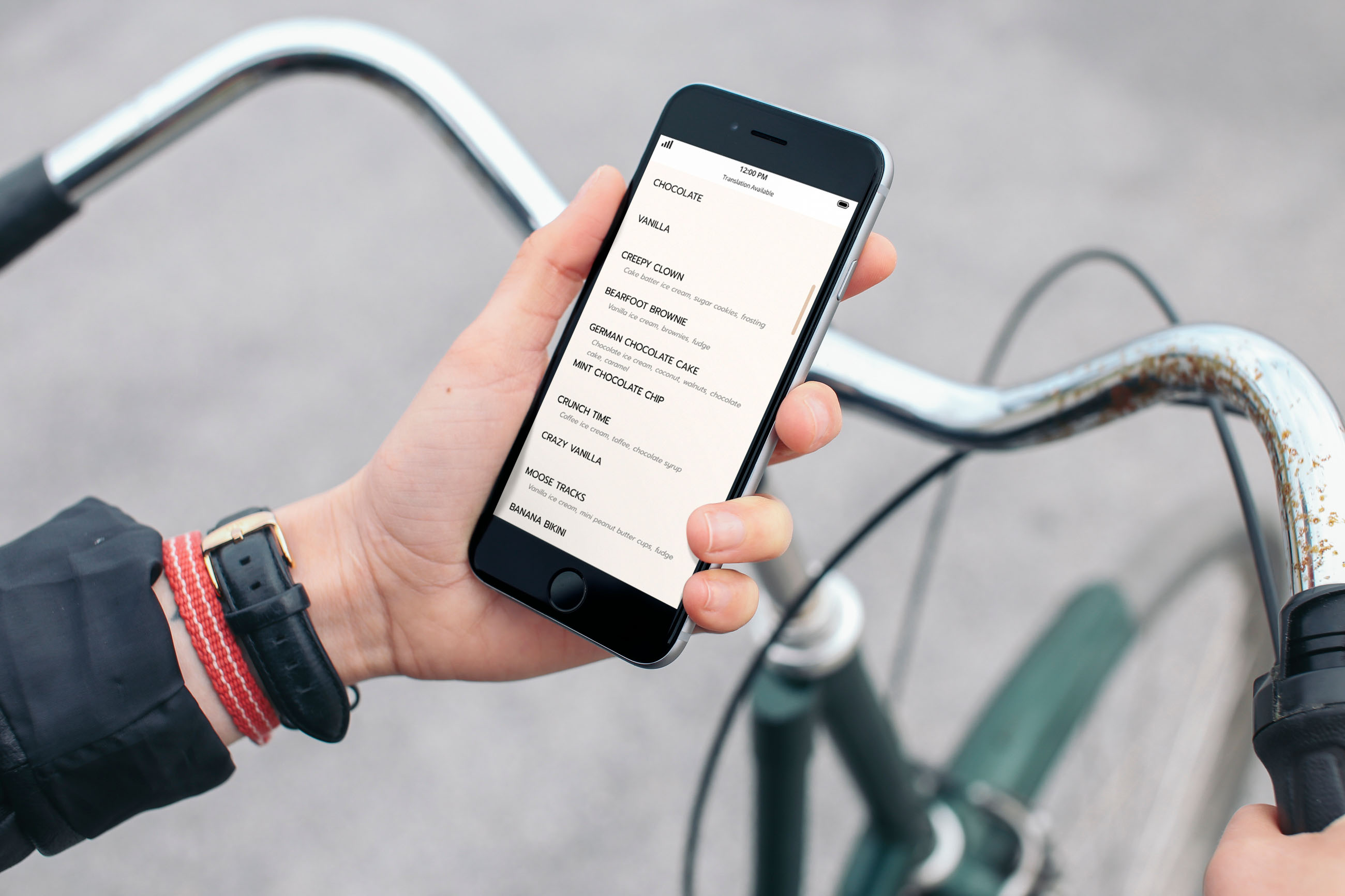
Unsurprisingly there are a lot of items that go into any food business: cups, uniforms, food packaging, informational brochures, business cards, indoor signs, etc. Scooples didn’t quite reach the level of a food truck, but they do the occasional outdoor event, so they need a cart that suits them for those days. Regular online orders weren’t preferred, but customers should still be able to easily view the menu.
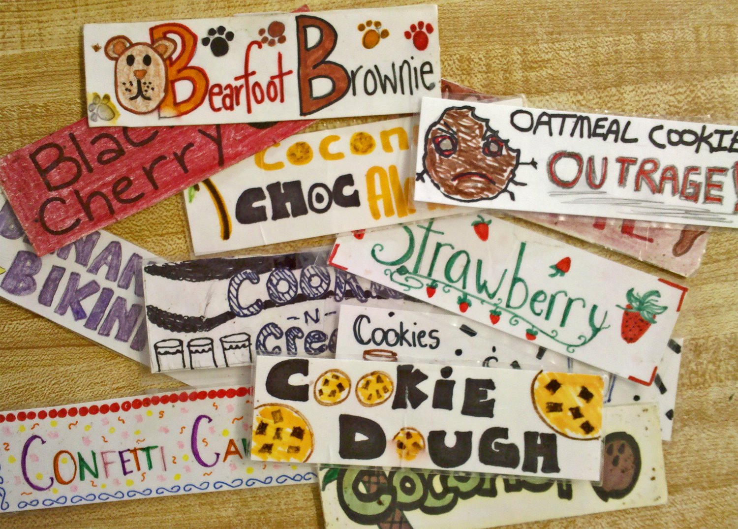
The physical store itself was cozy and employees did most of the indoor signage themselves, from the offerings to the individual flavor signs.
All of this provided a good starting point for an updated look.
First Draft
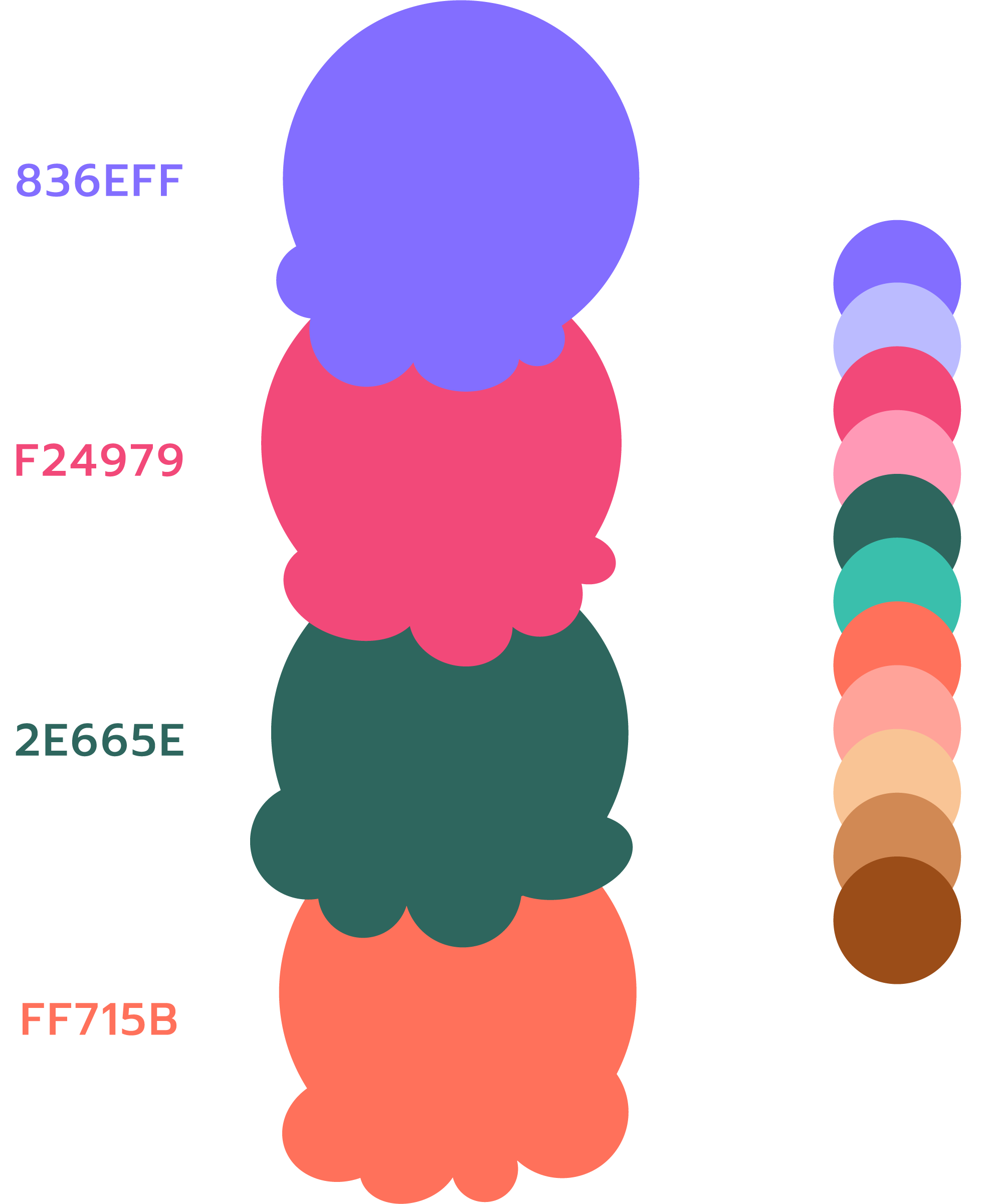
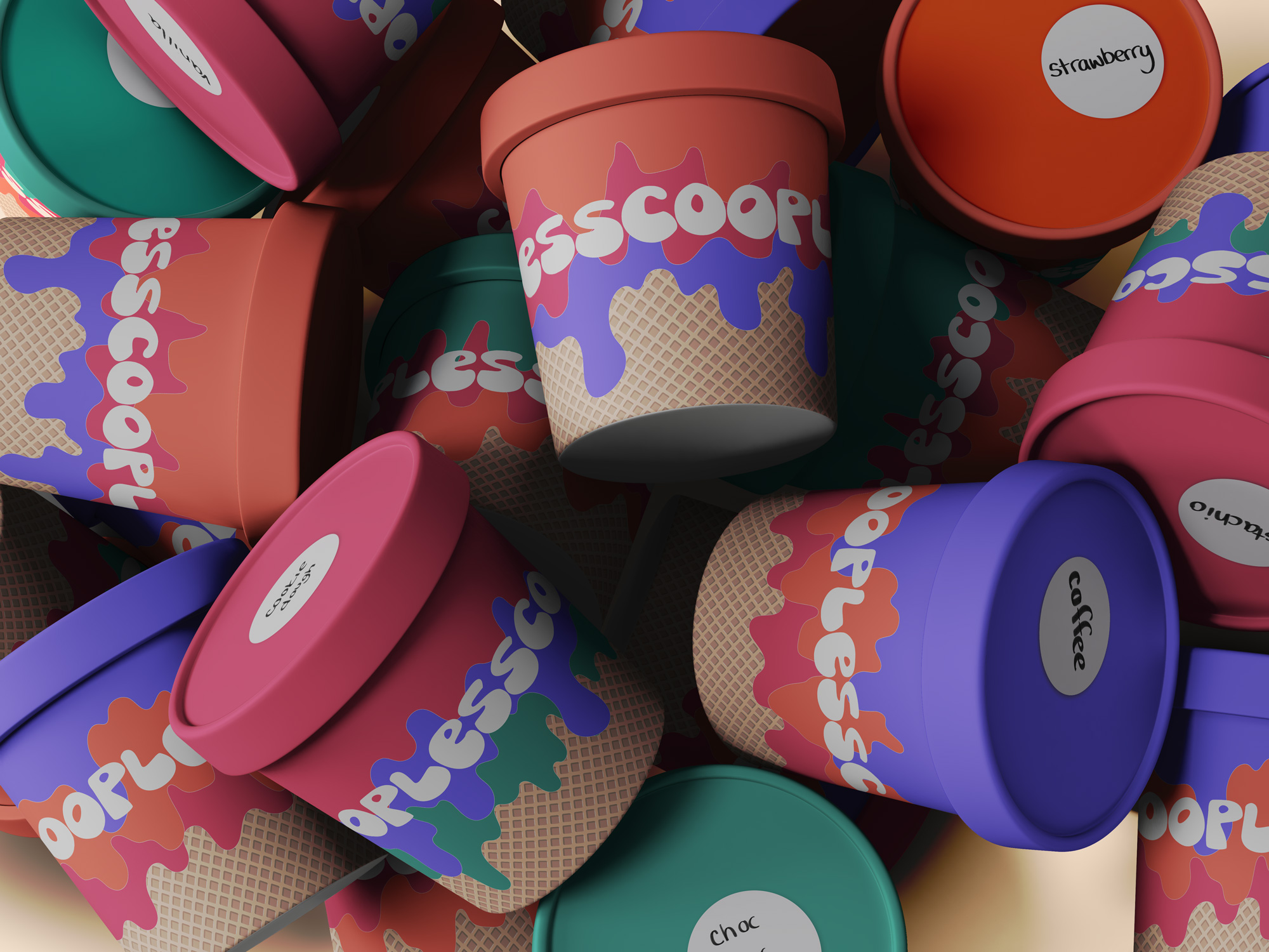
Right away, the color palette needed to be more eye-catching and not quite so drab – it’s an ice cream parlor, after all! Rather than come up with an entirely different color palette, it was easiest to take the existing one and turn the colors, to quote Spinal Tap, up to ELEVEN!
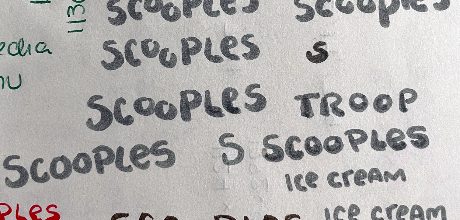
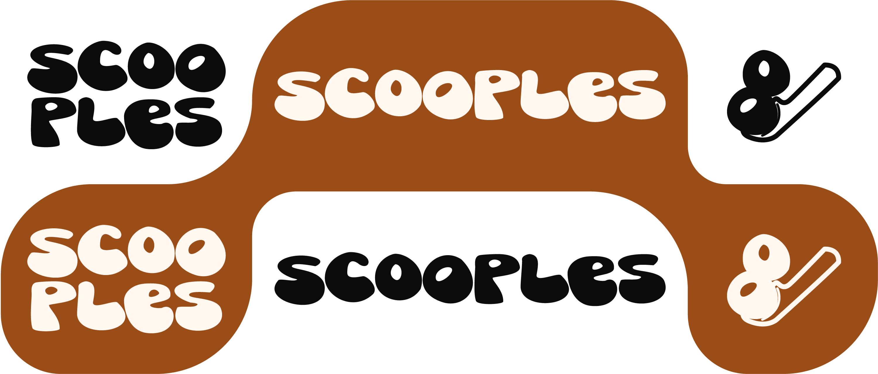
The logo had so many variations, it was difficult to nail down a single one to work off of. So, the easiest approach was to keep with the handmade and more friendly appeal with a hand-lettered logo.
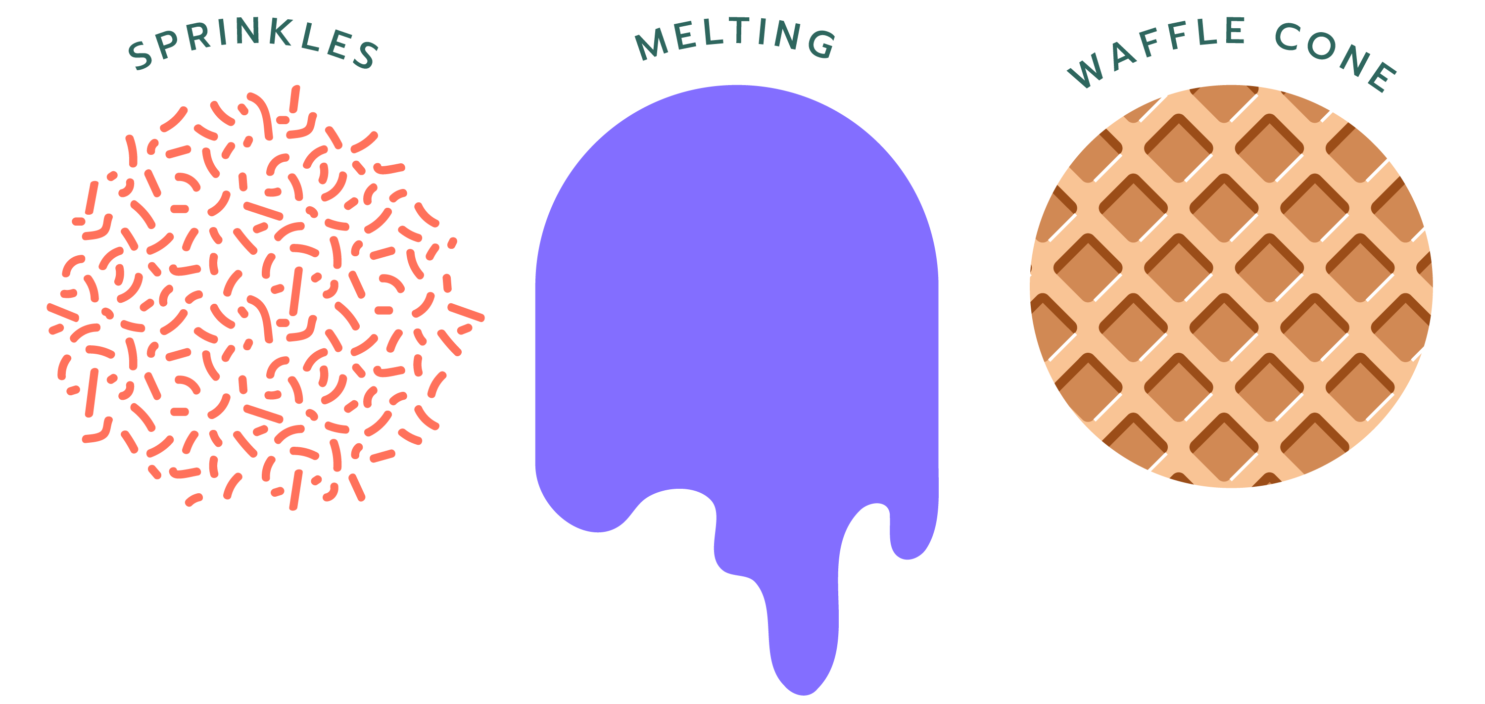
Then finally, went with the few noticeable motifs and made sure to include them throughout the branding.
Premiere
Sequel Talk
First priority is to expand Scooples’ online presence to potentially create a clear and simple way for customers to order custom cakes. Being able to regularly update what flavors are available would also be a huge benefit to customers, and could also help when it comes time to restock.
When it comes to branding, the one thing that’s hard to see from early on is just how much goes into creating an entire identity for a business. It’s not just the look and feel, but the language and tone that’s evoked as well, so it’s incredibly important to keep that in mind as the whole brand is shaped.
(Plus? Sometimes you really, really want ice cream throughout the process.)
