Responsive design UX/UI – March 2022
The Brief
There’s a quote that floats around the internet, courtesy of Top Gear host Richard Hammond:
I can’t remember if I took my malaria pill this morning. If I were a girl, I’d be pregnant a lot.
Funny? Yes. Accurate? Probably? Relatable? Absolutely.
Almost everyone who takes a prescription medication, at one point or another, has experienced the problem of forgetting to take a medication. For some people it’s a minor inconvenience, but for others it could have hugely negative consequences. Considering frequent prescription medication users also happen to include vulnerable members of society, an easy to use reminder app would beneficial users everywhere.
Tools used were Figma and Adobe Illustrator.
Setting the Scene
Research was conducted through an online survey, targeting people between 20-70 who either are on medications themselves, or care for someone who is. The main questions posed made sure to cover the important concerns:
- What do users want to accomplish?
- How do they accomplish that now?
- What are some potential issues or challenges?
The answers to which could be summed up as:
- To take their medications on time and never fall behind on refills
- Phone/watch reminders, post-it notes, weekly pill organizers, notes in a personal calendar, associating some medications with meals
- Memory, external distractions, personal willpower (not being lazy)
I learned how important it is to remember that the human brain operates weird sometimes, and some things just can’t be explained or easily fixed. Think of, say, a daily vitamin. Have you ever taken it and then almost immediately questioned whether you took it, or was your brain just remembering when you took it yesterday?
A competitive audit was also done to get an idea of what sort of products already exist in the market, and how they separated themselves from one another. Almost all of them offered so many features like connecting with doctors, health articles, some sort of reward system, mood and symptom journals, etc. Great features, all with their own benefits, but it can be a little overwhelming.
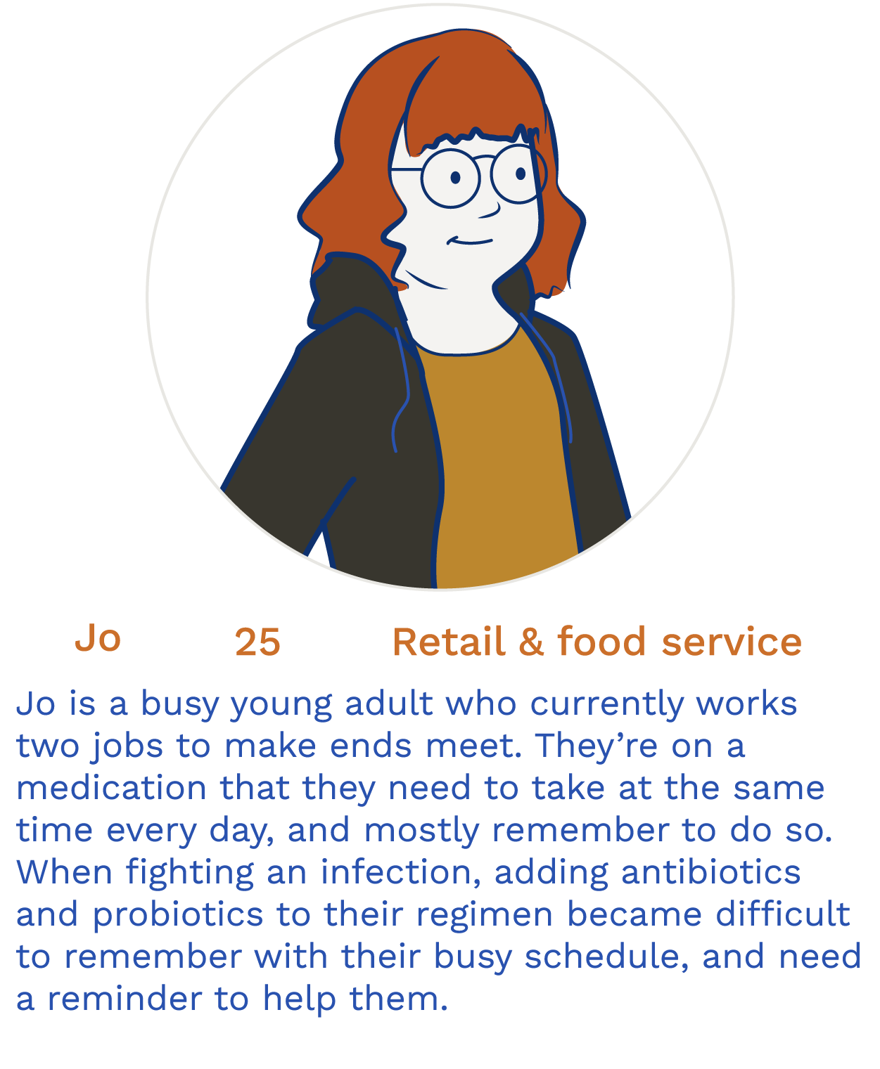
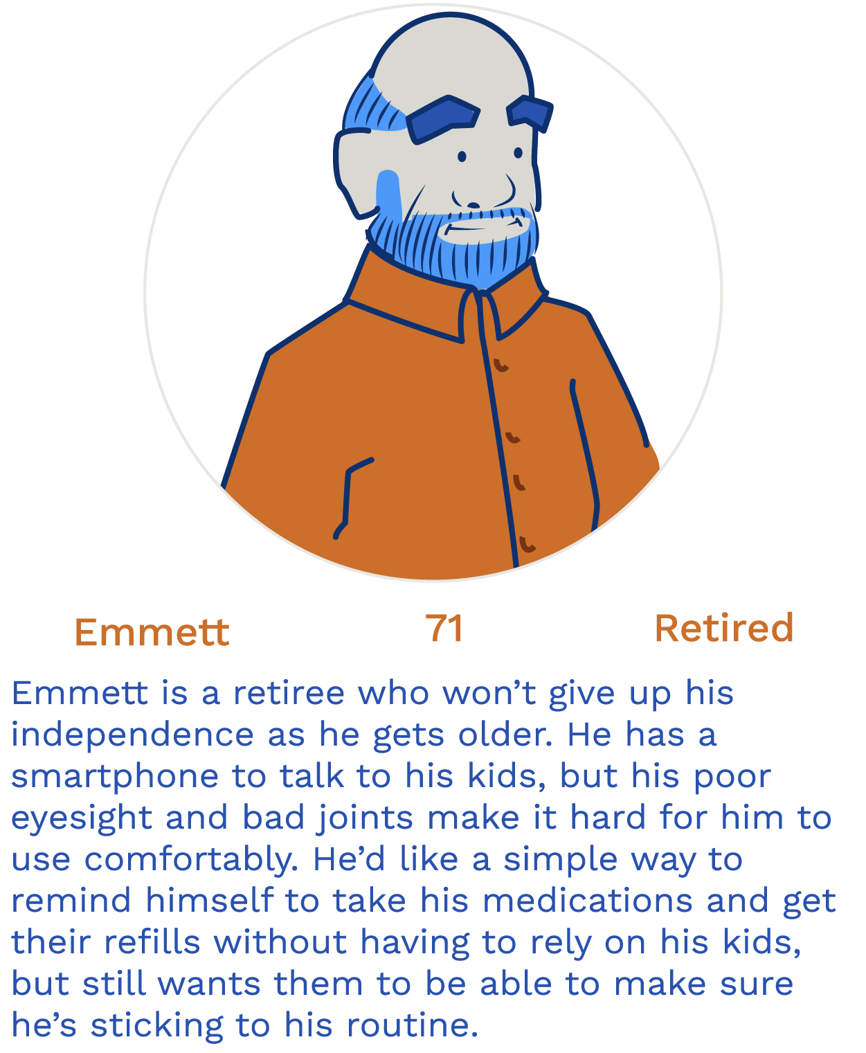
The Cast
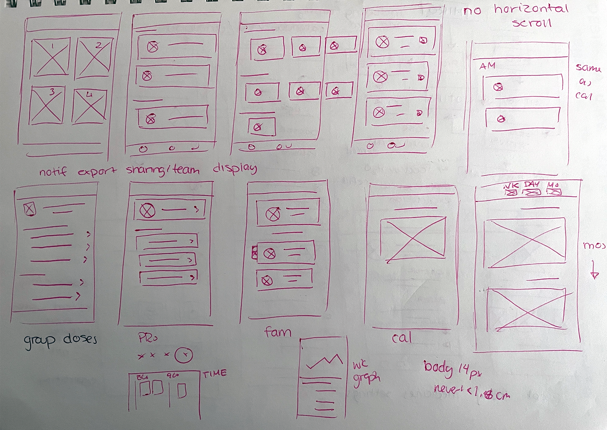
First Draft
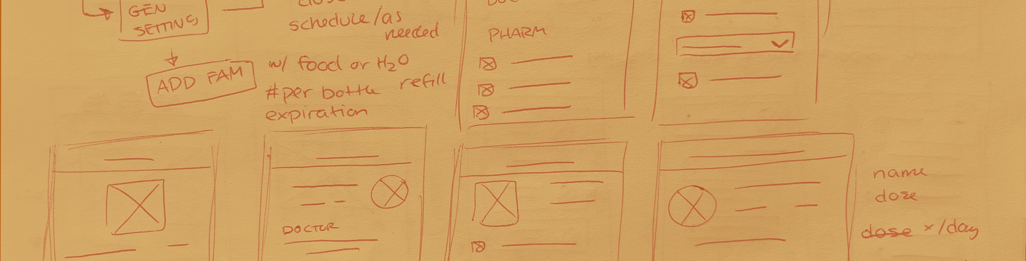
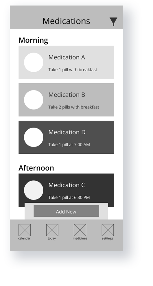
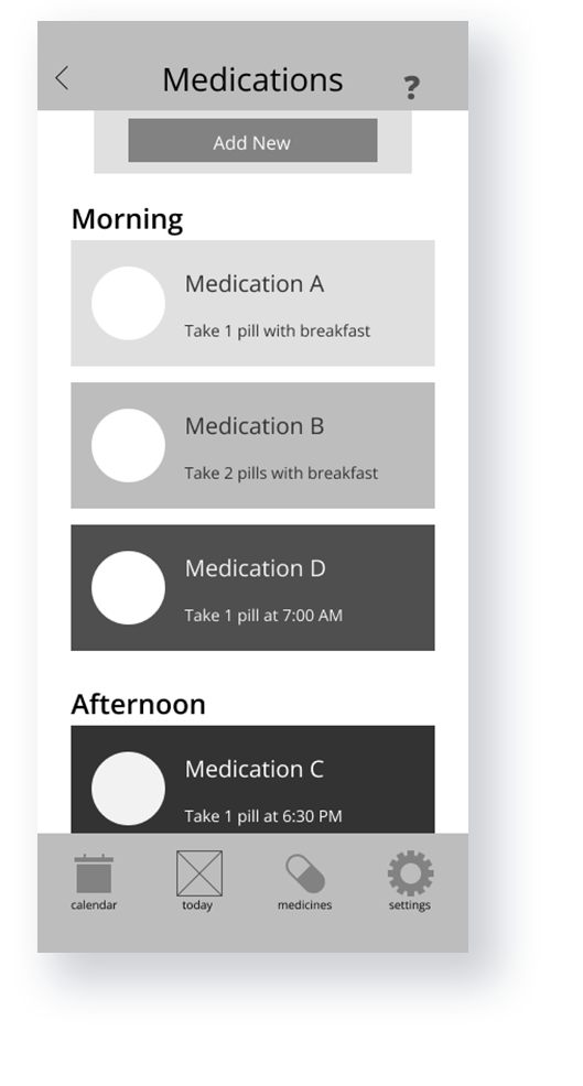
Starting from the bottom up was the best way to make sure the user flow was as simple as possible when transitioning to a web platform. Since I didn’t want there to be too many features, I laid out what I considered to be absolutely essential.
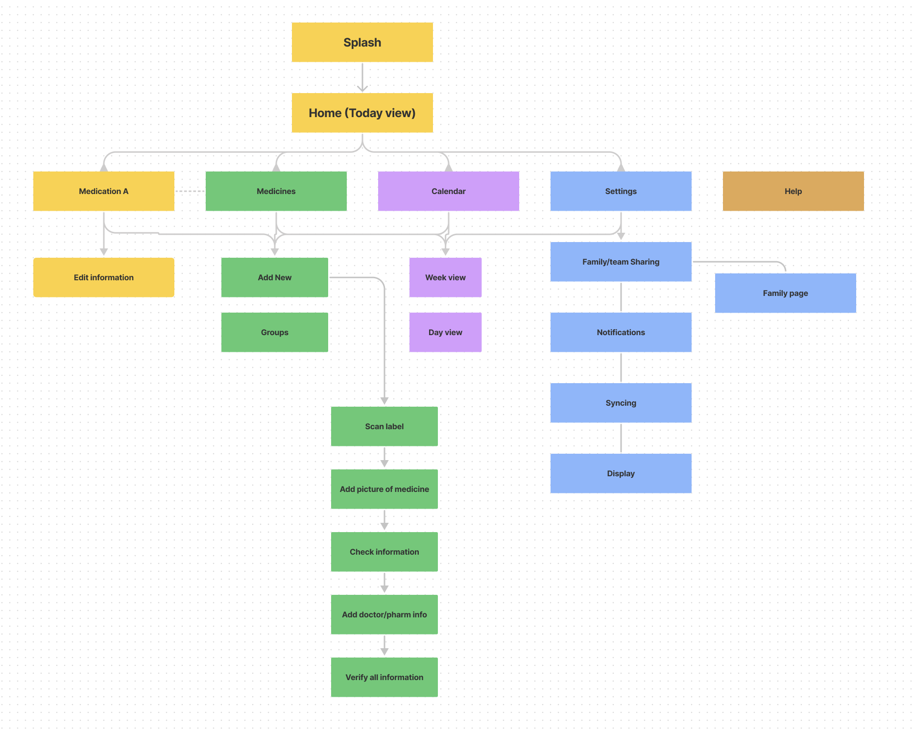
Accessibility is something I always keep in mind, but in this particular case it was at the absolute forefront of the design process. I wanted to make sure the user experience is as smooth as possible, so I made sure to go with much simpler layouts and highly identifiable features.
After digitizing the wireframes, a skeleton version of the user flow was created for a usability study.
Production Notes
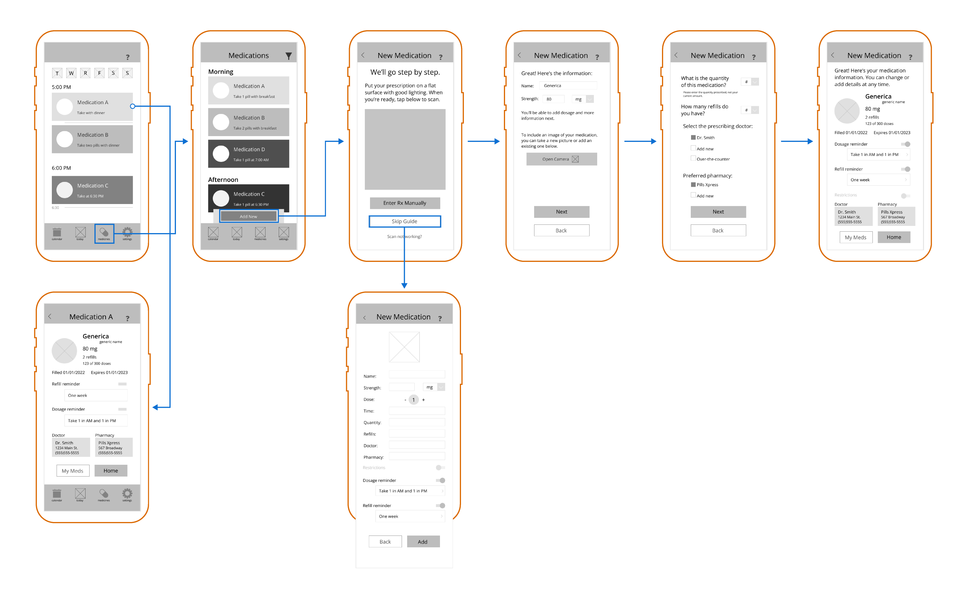
Right away there were some important distinctions that were left out – for example, doses can vary for some people. And when it comes to accessibility, some pages with too much information were cluttered and probably hard to navigate for unfamiliar users.
What’s wrong with using your phone’s built-in alarm?
Nothing – in fact, a lot of people already do that. But let’s say you want to remember what your medication looks like, if you need to take it with food or on a empty stomach, if you need to drink a lot of water with it, those sort of things. “Take two blue capsules before food but drink 4 oz of water” is a little long for an alarm.
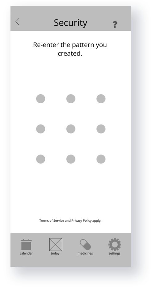
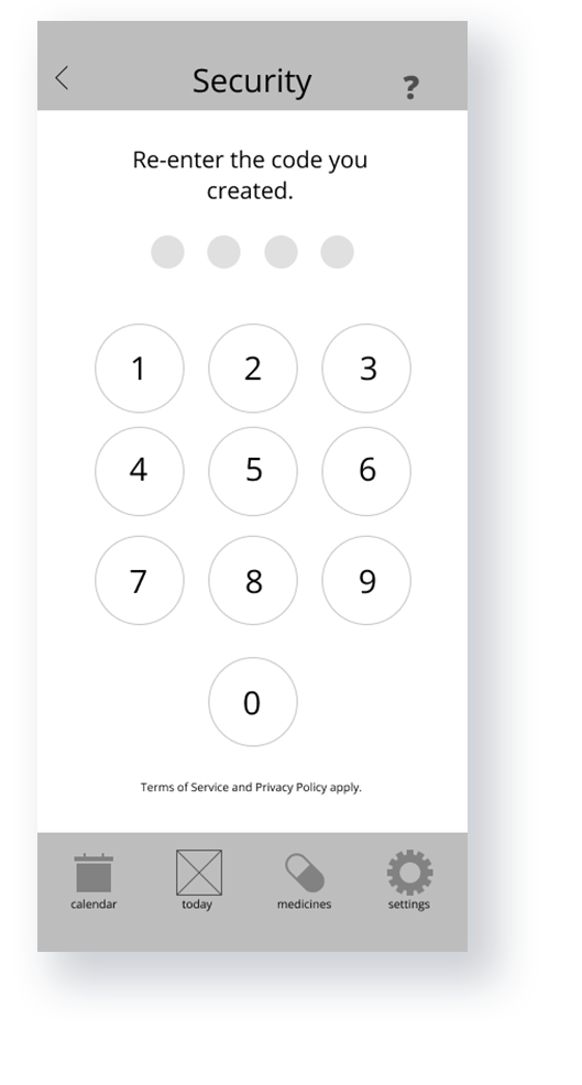
Won’t people who aren’t familiar with smartphones, particularly older people, just forget their password?
There have actually been studies on exactly this, and even in the context of personal health apps. Short answer is no, and that patterns and PIN verification were the most successful methods for older age groups. The more you know!
Premiere
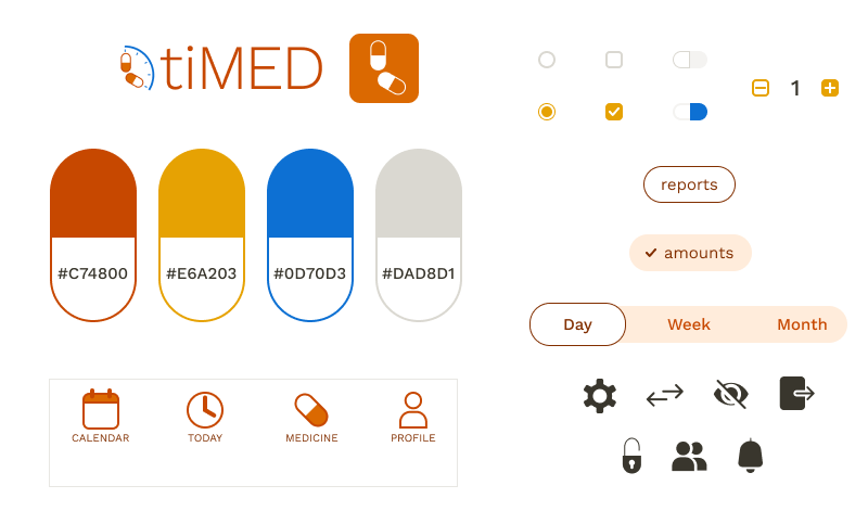
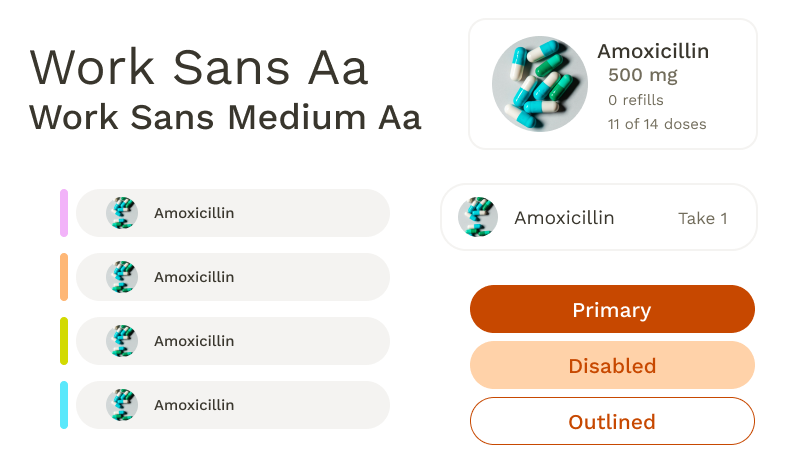
I wanted a color palette that would stand out, so I picked a color palette off of a common icon: pill bottles. Turns out the biggest challenge I faced was trying to use orange and yellow in tandem with the accessibility considerations.
User Awareness
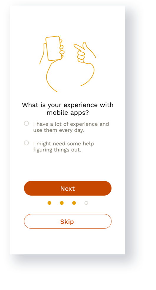
During the initial onboarding process, users are asked to consider their familiarity with mobile apps. If they’re inexperienced, this automatically ensure that guides were used for all of the main features within the app.
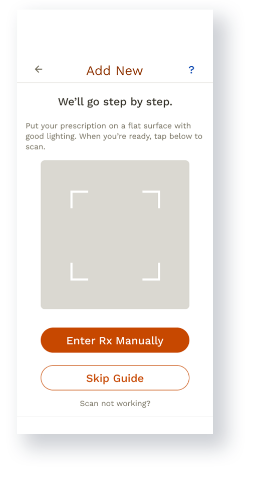
Scanning Technology
The ability to scan prescription labels exists for many pharmacy apps, which makes it incredibly easier for users to order refills. Rather than order refills, though, the feature would only read prescription names off of labels to save users from having to type something like “hydrochlorothiazide”.
Sharing
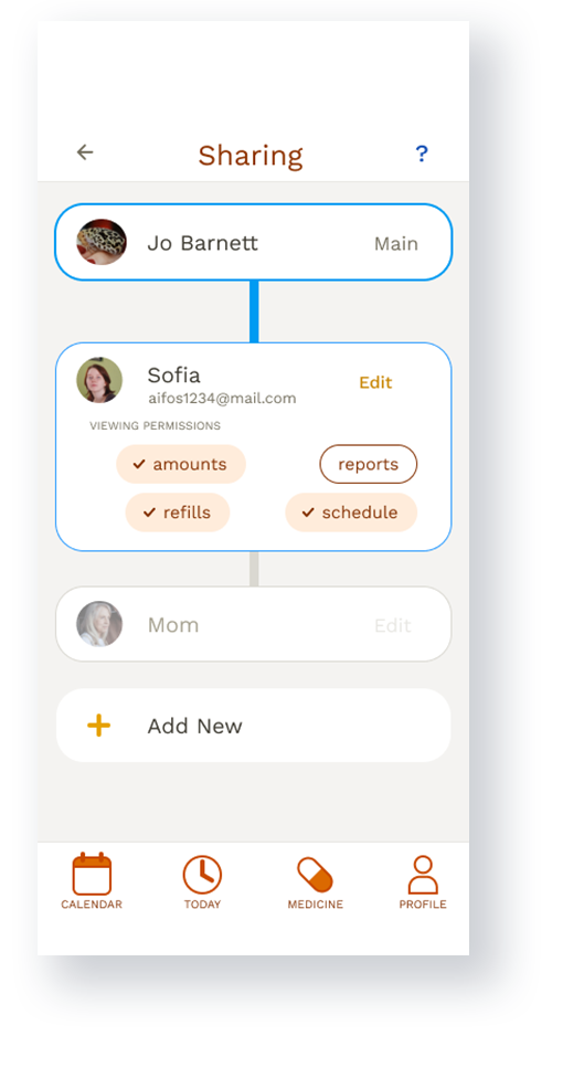
Having the option to share information with other people adds another level of security, and also gives users more independence and peace of mind.
Responsibility
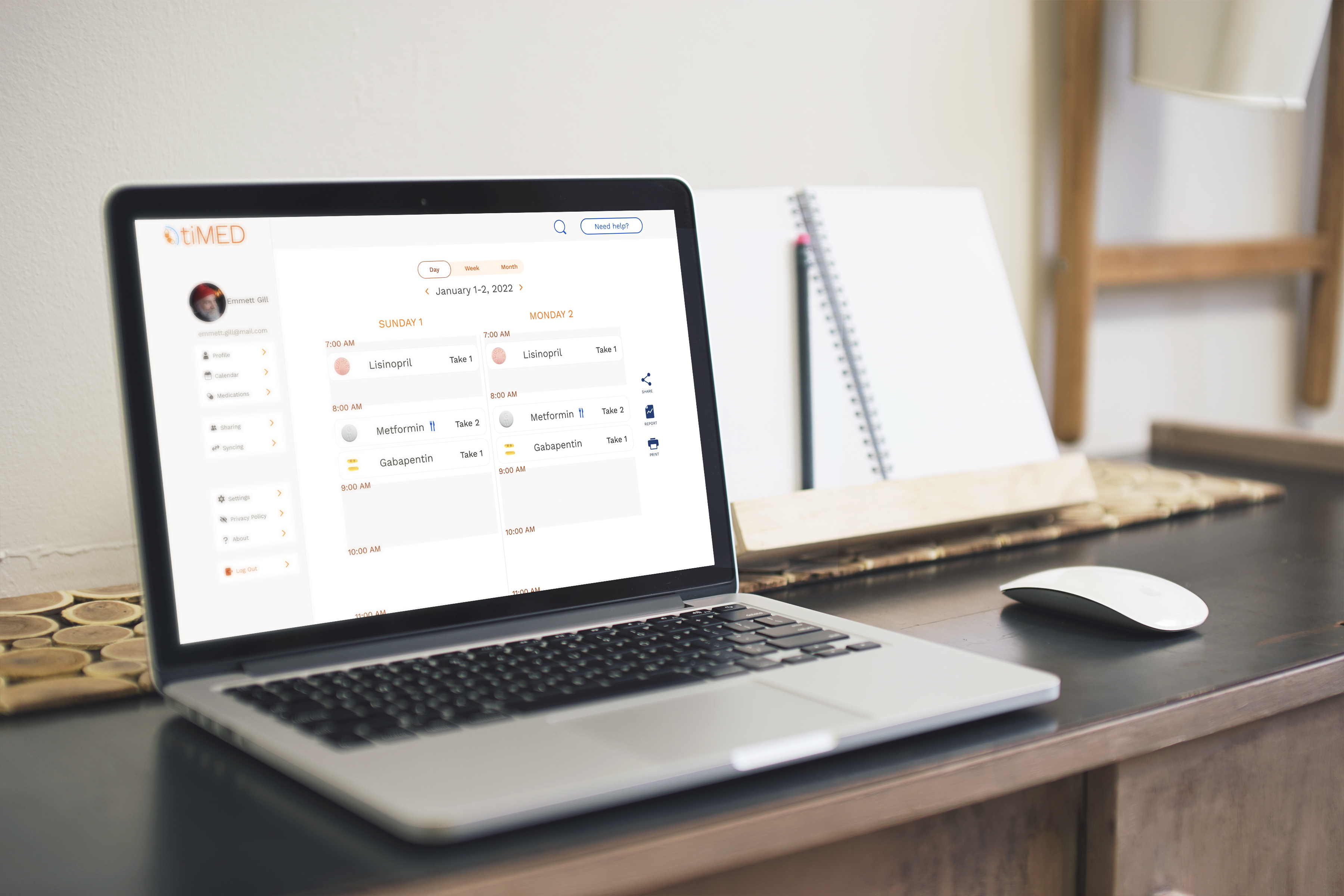
Working up from a mobile design was a clear necessity from the beginning, both for ease of access but also ease of use. Chances are if someone isn’t comfortable with a smartphone, perhaps due to its small size, then being able to access the information on a larger platform was imperative. Plus, it allowed space to expand important information.
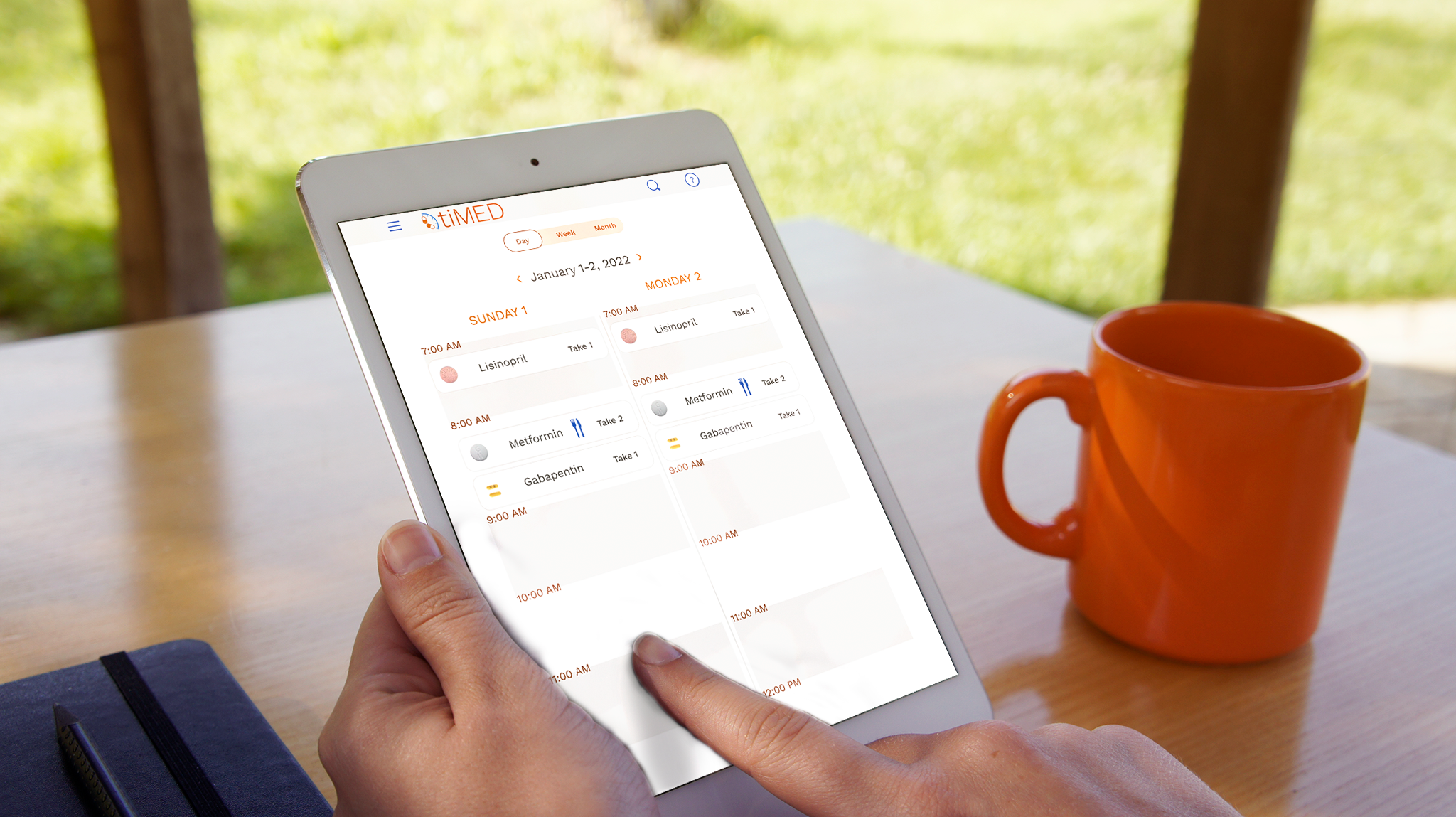
The small size of a smartphone screen limited viewing to either a single day or a week, while larger screens allow for two-day-at-a-time viewing.
Sequel Talk
Accessibility would be the main focus of expansion of the app, including options for layouts that include larger graphics and text, as well as colorblind options. It would also include more details of the sharing aspect, specifically how it looks to different users on different platforms.
As mentioned before, the biggest challenges when working on the app were accessibility considerations, and remembering the important details of medications that needed to be included. These sort of challenges are absolutely worth it, though, as accessibility is crucial, particularly in an app that revolves around personal health.
